Math 229: Statistics Using R
Course Slides
| Dr. Brian Walton |
|---|
| James Madison University |
as of April 30, 2026
Introduction to R, RStudio, Quarto
Working with R
Scripting/Programming Language: R
Data Analysis Application: RStudio
Document Format: Quarto
Computers and Data (1)
Atomic data
- integers
whole numbers
- floating point numbers
decimal and scientific notation
- boolean
TRUE/FALSE
- character
simple text
Computers and Data (2)
Complex data
- vector
ordered collection of single data type
- list
ordered collection of multiple data types
- data frame
table of data where columns are vectors (same data type)
Programming Variables
Variable name: human reference to location in computer memory
-
Assignment:
name <- [expression result to store]
[expression result to store] -> name
Later expressions can use the variable name and the currently stored memory value will be used
RStudio (Day 2 Begins)
Integrated Development Environment (IDE)
File editor
R scripts (with debugger)
Quarto documents (merge formatted written documents with embedded computations)
Live R session
Data environment (inspect variable memory), package manager, plot viewer
Help system
Markdown
Markdown is a plain text method to indicate how text should be formatted.
#or##or###for headers (with levels)_word_or*word*to underline**word**to bold$formula$for inline math and$$formula$$for display math`code`for inline code
Task: Create Quarto File
Two sections with headers (level 1). One of the sections should have two subsections with headers (level 2).
Include a paragraph that includes some words that are bolded and others that are underlined. Can you get some that do both?
Add a mathematical formula on its own line (displaymath) that shows \(\displaystyle y=ax^2+bx+c\)
-
Include code
x <- 12
a <- 1
b <- -2
c <- 3
y <- a*x^2+b*x+c
Chapter 1: Statistics Overview
Key Ideas
Data: information gathered with surveys and experiments
Statistics: the art and science of learning from data
Statistical investigative process:
formulate a statistical question
collect data
analyze data
interpret and communicate results
Major Components of Statistics Methods
Design: State goal/question and plan how to collect data
Description: Summarize and analyze the data
Inference: Make decisions and predictions to answer question
Builds on a foundation of probability, which is a framework for quantifying how likely various possible outcomes are.
Populations vs Samples
- subject
individual entity in a study
- population
total set of subjects in which we are interested
- sample
subset of population for whom we have data
Learning goal: Be specific and precise about describing these three terms.
Example: An Exit Poll
The purpose was to predict the outcome of the 2010 gubernatorial election in California.
An exit poll sampled 3,889 of the 9.5 million people who voted. Define the sample and the population for this exit poll.
Descriptive vs Inferential Statistics (Begin Day 3)
- descriptive statistics
Refers to methods for summarizing the collected data. Summaries consist of graphs and numbers such as averages and percentages.
- inferential statistics
Refers to methods of making decisions or predictions about a population based on data obtained from a sample of that population.
Descriptive Example
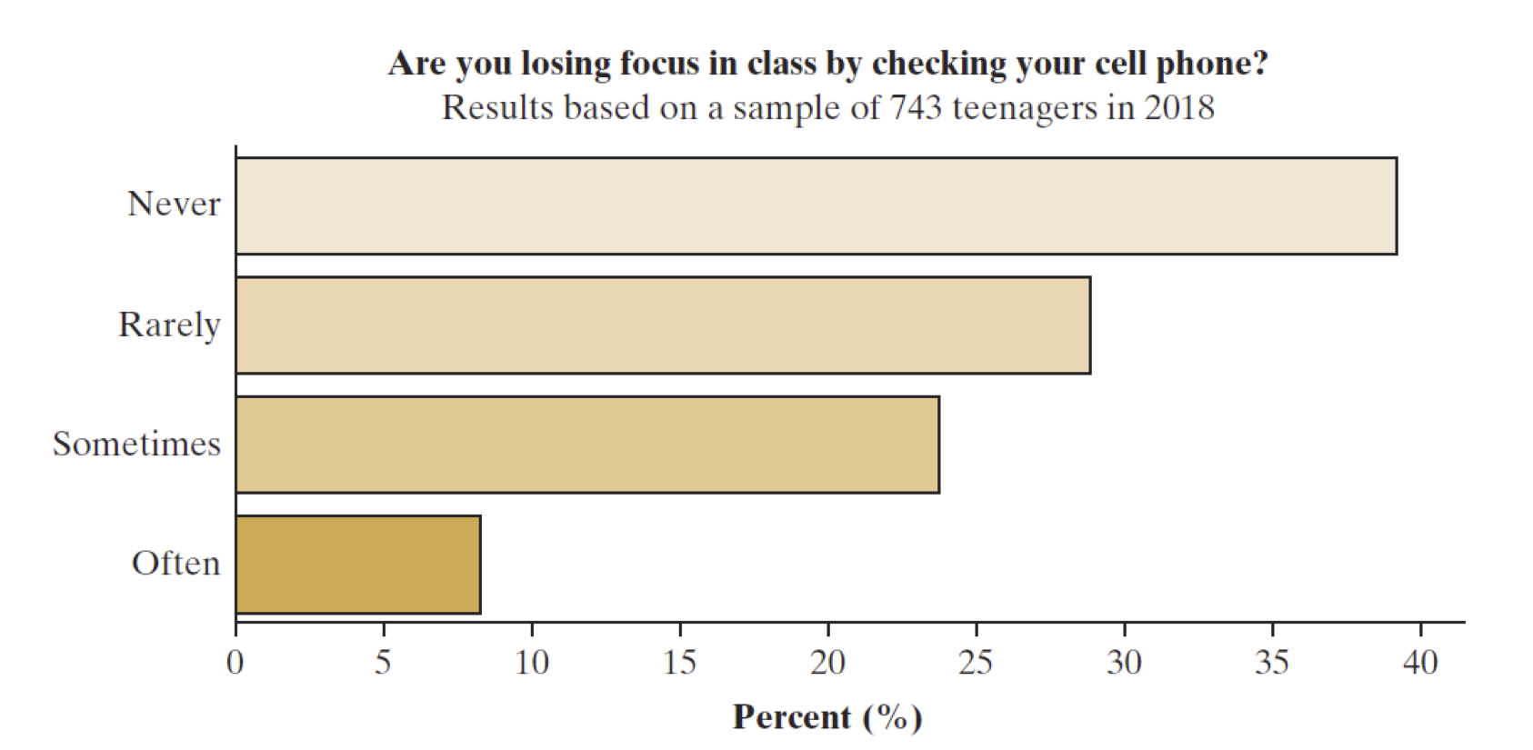
What makes this descriptive? The graph shows the result of a survey of 743 teenagers (ages 13-17) about their handling of screen time and distraction. (Fig 1.1 from textbook)
Inferential Example
What makes this inferential?
We’d like to investigate what people think about banning single-use plastic bags from grocery stores. We can study results from a January 2019 poll of 929 New York residents.
In that poll, 48% of the sampled subjects said they would support a state law that bans stores from providing plastic bags.
We can predict with high confidence (about 95% certainty) that the percentage of all New York voters supporting the ban of plastic bags falls within 4.1% of the survey’s value of 48%, that is, between 43.9% and 52.1%.
Parameter vs Statistic
- parameter
a numerical summary for a population
- statistic
a numerical summary of a sample taken from the population
Themes to Watch
randomness and random sampling: essential for using samples to inform us about populations
variability: how observations vary
within a sample: variability among individuals
between samples: variability of statistical results computed from sample
margin of error: how close we expect an estimate to fall to the true parameter value
statistical significance: measure of the strength of evidence, typically measured by probability or likelihood
Sections 2.1-2.2: Exploring Data with Graphs
Key Ideas
Types of Data: categorical vs quantitative (discrete and continuous) variables
Describing the distribution of data
relative frequency (categorical)
shape, center and variability (quantitative)
Choosing appropriate graphical representations of data
categorical: bar graph (preferred), pie chart
quantitative: dot plot, stem and leaf plot, histogram, box plot
Structure of Data Frames
The fundamental structure of data is in a rectangular table.
Row: refers to an individual subject or experimental replicate.
Column: a single variable representing a specific measurement or characteristic.
Best Practice: a header row states what the variables represent
We import a table to create a data frame
Importing Data Using RStudio
Open a project to have a single folder containing your Quarto file and any data files you work with. The easiest format to use is a CSV file.
read.csv(filename): a basic import routine in Rread_csv(filename): an improved import routine fromreadrlibrary (tidyverse).Both routines have optional arguments (other than filename) to customize how the data are read.
Download Sample Data
The textbook has a website that contains many useful data sets for learning: ArtOfStat.com
Click on Datasets
Look for Chapter 2 data sets and find one named “FL Student Survey”. Download the CSV file and save it to your project directory.
Import the data frame using
read.csv("fl_student_survey.csv")or withread_csv(after typinglibrary(readr)to load the library)
Categorical Data (Begin Day 5)
The distribution for categorical variables is characterized by the frequency (raw counts) and relative frequency (proportion or percentage) of occurrences of each of the different categories.
To calculate relative frequency or proportion, divide the count of a single category by the total number of observations.
To calculate a percentage, multiply the proportion by 100.
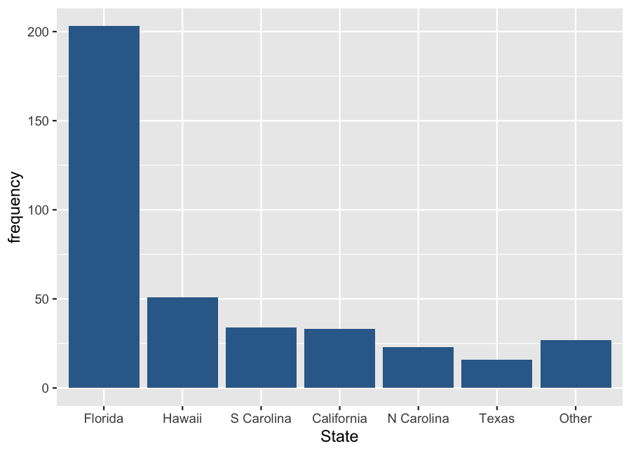
Example: Shark Attacks (a)
| State | Frequency |
|---|---|
| Florida | 203 |
| Hawaii | 51 |
| S Carolina | 34 |
| California | 33 |
| N Carolina | 23 |
| Texas | 16 |
| Other | 27 |
| Total | 387 |
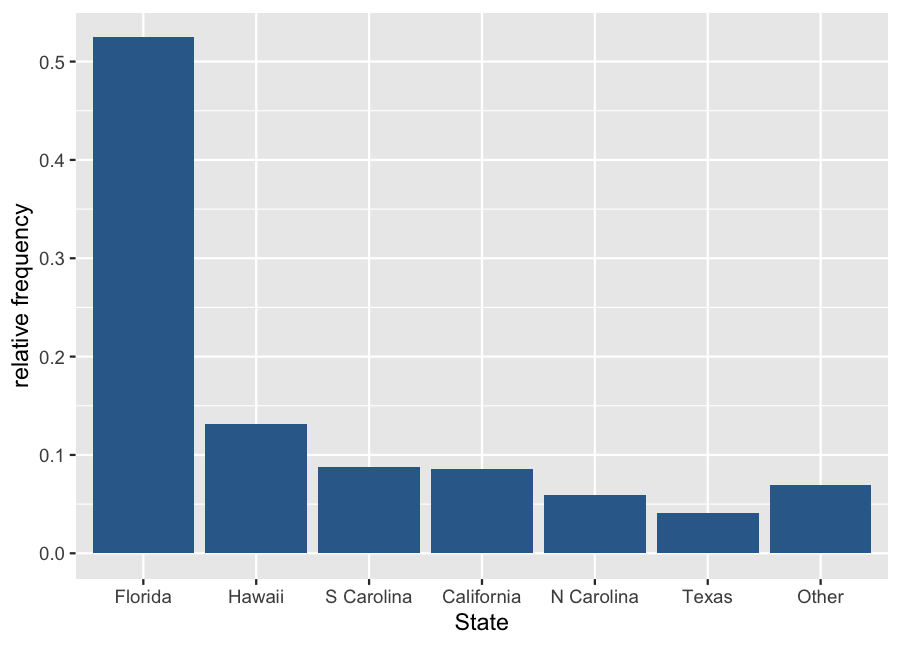
Example: Shark Attacks (b)
| State | Frequency | Proportion |
|---|---|---|
| Florida | 203 | 0.525 |
| Hawaii | 51 | 0.132 |
| S Carolina | 34 | 0.088 |
| California | 33 | 0.085 |
| N Carolina | 23 | 0.059 |
| Texas | 16 | 0.041 |
| Other | 27 | 0.070 |
| Total | 387 | 1.000 |
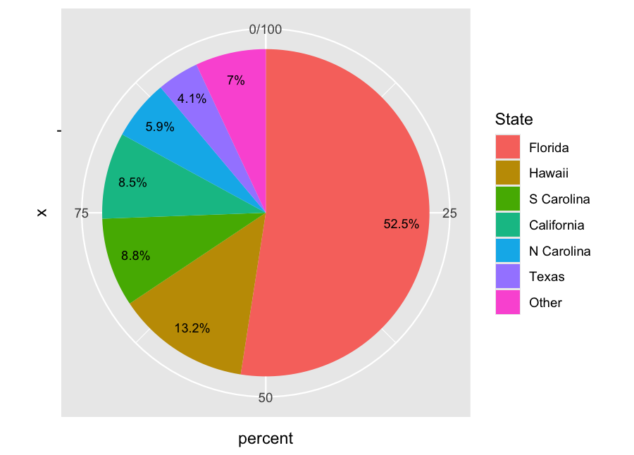
Example: Shark Attacks (c)
| State | Frequency | Percentage |
|---|---|---|
| Florida | 203 | 52.5% |
| Hawaii | 51 | 13.2% |
| S Carolina | 34 | 8.8% |
| California | 33 | 8.5% |
| N Carolina | 23 | 5.9% |
| Texas | 16 | 4.1% |
| Other | 27 | 7.0% |
| Total | 387 | 100% |

Example: Shark Attacks (d)
| State | Frequency | Percentage |
|---|---|---|
| Florida | 203 | 52.5% |
| Hawaii | 51 | 13.2% |
| S Carolina | 34 | 8.8% |
| California | 33 | 8.5% |
| N Carolina | 23 | 5.9% |
| Texas | 16 | 4.1% |
| Other | 27 | 7.0% |
| Total | 387 | 100% |
Quantitative Data
The distribution is characterized by the shape of the relative frequencies that data values appear in intervals (often called bins).
Choose or calculate a bin width for how wide each interval will be.
\begin{equation*} \text{width} = \frac{\text{total width}}{\text{# of bins}} = \frac{\text{max bin value - min bin value}}{\text{# of bins}} \end{equation*}Create a consecutive partition of intervals that cover the full data.
Decide how to count values appearing exactly on boundaries.
How would you count frequencies of the following data into 5 bins?
10, 12, 12, 15, 18, 20, 21, 21, 24, 28, 32, 32, 35, 36,
40, 42, 45, 48, 48, 52, 56, 56, 58, 60, 64, 70, 72
Stem and Leaf Plot
Not really a graphical display, a stem and leaf plot is a textual method of exploring shape for a relatively small set of data.
stem: leading digits of each value to a specified place value
leaf: next place-value digit in the number
Make a stem and leaf plot using two columns.
Column of sequential stems, including any skipped values
Column of leaves from the data, sorted in order
Stem and Leaf Example
Using the earlier list of values: 10, 12, 12, 15, 18, 20, 21, 21, 24, 28, 32, 32, 35, 36,
40, 42, 45, 48, 48, 52, 56, 56, 58, 60, 64, 70, 72 Here is the corresponding stem and leaf plot using a stem defined by the tens position.
1 | 02258
2 | 01148
3 | 2256
4 | 02588
5 | 2668
6 | 04
7 | 02
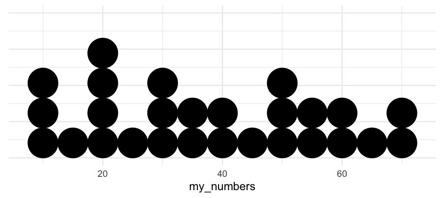
Dot Plot
A dot plot is similar to a stem and leaf plot, but instead of using digits to create the plot, we just put solid dots next to each other along an axis. It is also most useful when there is a relatively small number of data points.
For discrete variables, we can often position the dots at exact value positions.
Otherwise, we use bins and position the dots at the center of each bin.
Using the same data and a bin width of 5:
10, 12, 12, 15, 18, 20, 21, 21, 24, 28, 32, 32, 35, 36,
40, 42, 45, 48, 48, 52, 56, 56, 58, 60, 64, 70, 72
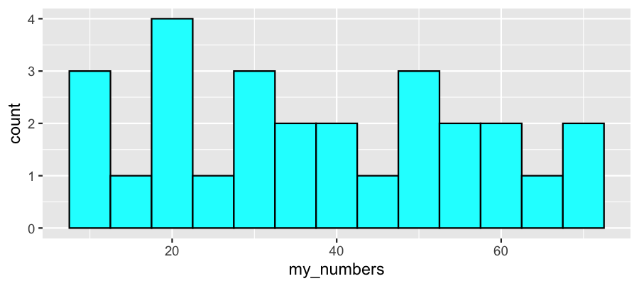
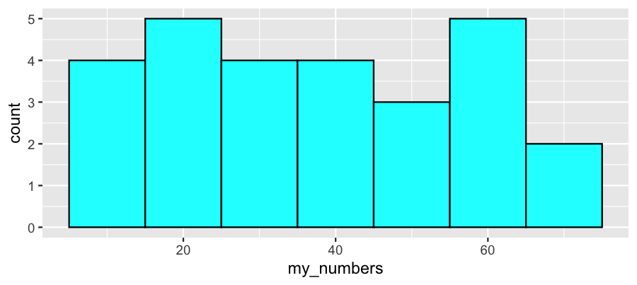
Histogram
A histogram uses adjacent rectangles to show the distribution based on a partition of bins. The left and right edges of the rectangles illustrate the end-points of each bin. The height of the rectangle matches the frequency.
Using the same data and bin widths of 5 and 10:
10, 12, 12, 15, 18, 20, 21, 21, 24, 28, 32, 32, 35, 36,
40, 42, 45, 48, 48, 52, 56, 56, 58, 60, 64, 70, 72
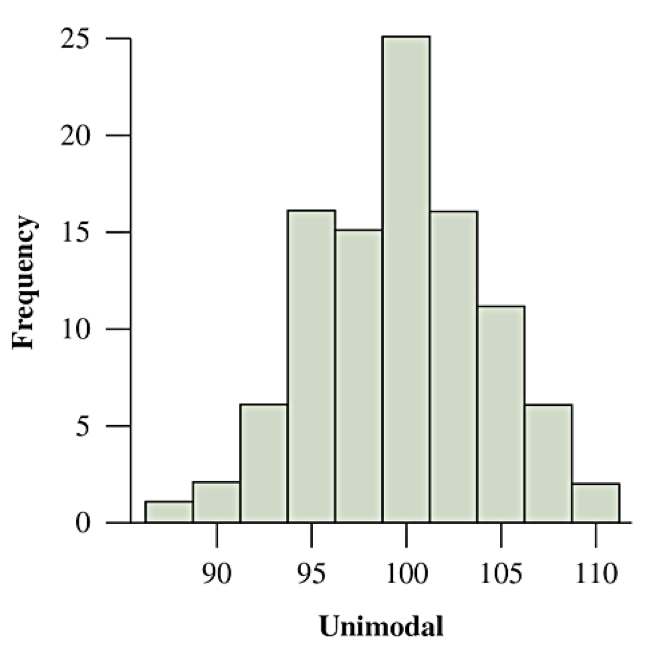
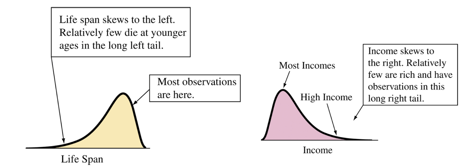
Describing Shape
Does the shape have a single predominant mound? Then the distribution is unimodal
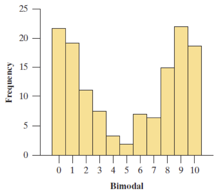
Does the shape have a two predominant mounds? Then the distribution is bimodal
Does the shape look like it is reflected over the center? Then the distribution is symmetric. Otherwise it is asymmetric.
-
Does the shape look it is stretched out more on one side than the other? Then the distribution is skewed.
If the shape stretches from the center (mean/median) further to the right, it is skewed to the right.
If the shape stretches from the center (mean/median) further to the left, it is skewed to the left.
Unimodal vs Bimodal
Shape, Symmetry and Skewness
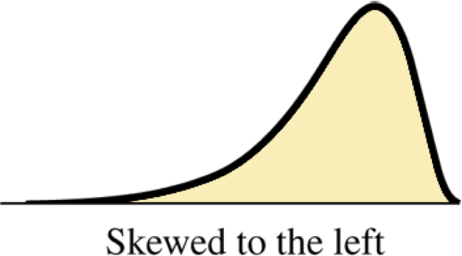
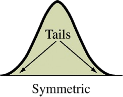
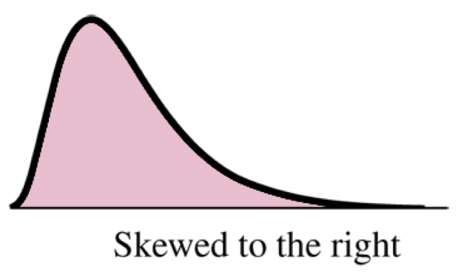
Find the center of the distribution. On which side does the distribution (tails) stretch out further? That is the direction it is skewed.
Sections 2.3-2.6: Exploring Data with Numerical Summaries
Key Ideas (Begin Day 6)
Quantitative data is characterized by the distribution center, variability, and skewness.
Measures of position (center): mean, median, mode. Learn how to identify and compute mean and median and how they are influenced by outliers and skewness.
Measures of variability: range, standard deviation, variance (squared deviation), interquartile range (IQR). Learn how to compute and interpret these measures.
Outliers: Two methods to identify potential outliers are (1) using standard deviation for bell-shaped distributions or (2) using IQR in general.
Draw and interpret boxplots.
Compute and interpret \(Z\) scores, which standardizes measurements relative to the mean and standard deviation
Measuring the Center of Quantitative Data (2.3)
Median: Middle of data values when sorted. 50% above and 50% below.
If an odd number of data points, use the middle value (same number before/after).
If an even number of data points, use the midpoint of the two middle values.
Mean: Average of all values, calculated as the sum of the observations and divided by the number of observations.
\begin{equation*} \overline{x} = \frac{\sum x}{n} \end{equation*}Mode: Not really a measure of center, but the mode does measure the position of the value having the highest relative frequency.
The R commands that take a vector x of values and return the center values are literally median(x) and mean(x).
Exploration of Median and Mean
library(readr)
fl_student_survey <- read_csv("[link to file]")

hs_gpa_median <- median(fl_student_survey $ high_sch_GPA)
hs_gpa_mean <- mean(fl_student_survey $ high_sch_GPA)
In a Quarto document, you can perform calculations in a **code** block and save to a variable name in memory. Then we can access the calculated value in our **text** by including `r var_name`. (Actually, any single R expression can replace “var_name”.)
Calculation by Hand
To find the median, we need to either sort the data or create a stem and leaf plot or dot plot to see them sorted. Count the total number of measurements. Count through the list to the half-way point.
To find the mean, add up the measurements. If a number appears multiple times, you need to add it each time (or multiply the value times the number of repeats). Once you have the sum, divide by the number of measurements.
Example data: (Source: cereal.csv sodium values)
0, 340, 70, 140, 200, 180, 210, 150, 100, 130,
140, 180, 190, 160, 290, 50, 220, 180, 200, 210
Outliers
An outlier is an observation that falls well above or well below the overall bulk of the data.
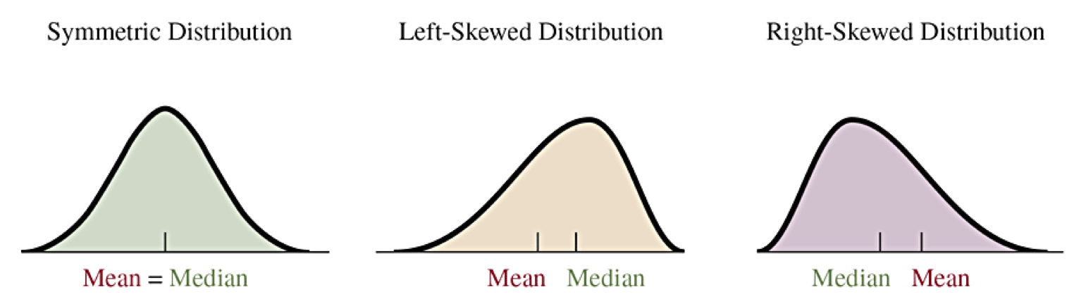
Because the median depends only on how many measurements are above and below it, it does not depend on the actual values of the highest and lowest values. The median is therefore resistant to outliers.
The mean, however, considers the sum of all values. It is analogous to a center of mass where each measurement is a unit mass on a number line at its value. An outlier therefore can pull the value of the mean toward the outlier. The mean is not resistant to outliers.
When a distribution is skewed, the mean will be shifted in the direction of the skew. For example, a distribution that is skewed to the right will have the mean to the right of the median.
The Mode
Not as important as the mean and median, the mode is a measure of position. It is not about the center of the data. Instead, it is about the highest frequency value. For a histogram, it would be the center of the bin that has the highest frequency.
It is more common to talk about the mode for categorical data as representing the category that has the highest frequency of observation.
Variability in Quantitative Data (2.4)
The mean and median give a representation for the center of the distribution for quantitative data. Measurements are spread around the center. We call the idea of spread variability and that observations have deviations from the center.
We need repeatable measures for how to quantify how much variability is in a data set.
range: the total width of the interval including all observations.
\begin{equation*} \text{range} = \text{max value} - \text{min value} \end{equation*}-
deviation: a measure for each observation’s displacement from the mean, \(x - \overline{x}\)
An observation with a positive deviation is above the mean.
An observation with a negative deviation is below the mean.
The sum of all deviations is always equal to 0.
Variance and Standard Deviation (Begin Day 7)
variance: an average of the squared deviations of observations, dividing the sum of squared deviations by \(n-1\text{.}\)
\begin{equation*} s^2 = \frac{\sum (x-\overline x)^2}{n-1} \end{equation*}standard deviation: the square root of the variance, and represents a typical scale for the deviations of the data.
\begin{equation*} s = \sqrt{\frac{\sum (x-\overline x)^2}{n-1}} \end{equation*}
Calculate all of the deviations for the set of values \(\{1, 2, 2, 4, 6\}\text{.}\) Then find the variance and standard deviation.
Interpretation of Standard Deviation
Consider two data sets \(A = \{0,0,0,2,4,4,4\}\) and \(B = \{0,2,2,2,2,2,4\}\) that have the same mean \(\overline x_A = \overline x_B = 2\text{.}\)
\(A\) is bimodal and symmetric with most of the data 2 units away from the mean. \(B\) is unimodal and symmetric with most of the data exactly equal to the mean.
Compare standard deviations:
Properties of Standard Deviation
The value of \(s\) represents a scale of variation. Larger values of \(s\) have greater variability.
\(s=0\) would mean all values are the same.
The units of measurement of \(s\) are the same as for observations. The units of measurement of variance is the square of the units of observations.
Standard deviation and variance are not resistant to outliers. Strong skewness or a few outliers can greatly increase \(s\text{.}\)
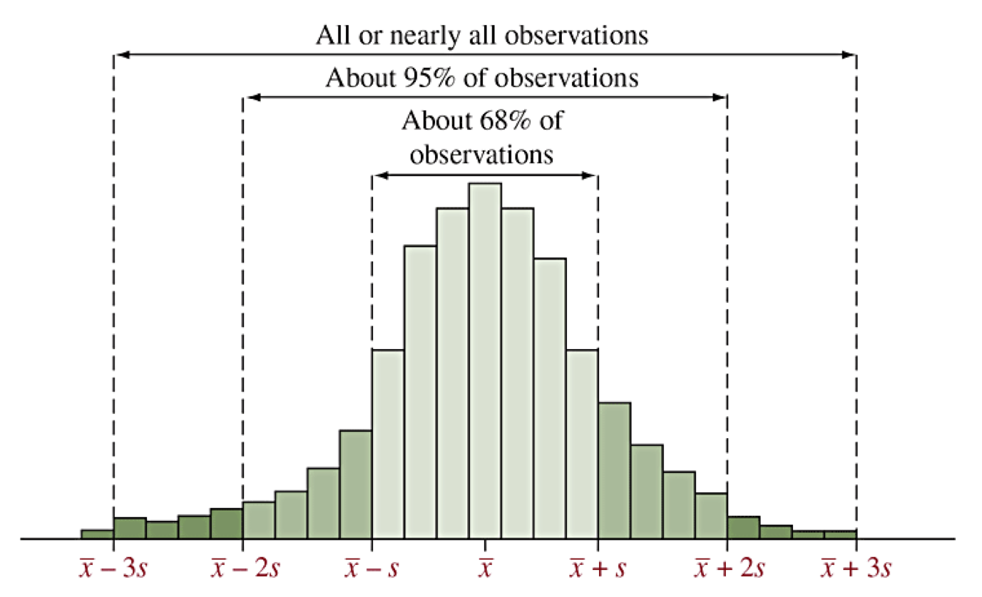
Empirical Rule of Bell-Shaped Distributions
Distributions that are unimodal and symmetric with tails that decay away are called often described as bell-shaped. The prototypical bell-shaped distribution is called the normal distribution. We often think of other bell-shaped distributions as being approximated by the normal distribution. (We will study this more later.)
The normal distribution has the following characteristics in relation to the standard deviation:
68% of all observations are within 1 standard deviation of the mean, that is between \(\overline x - s\) and \(\overline x + s\text{,}\) denoted \(\overline x \pm s\text{.}\)
95% of all observations are within 2 standard deviation of the mean, that is between \(\overline x \pm 2s\text{.}\)
99.9% of all observations are within 3 standard deviation of the mean, that is between \(\overline x \pm 3s\text{.}\)
Consequently, for bell-shaped distributions, any observations that are outside of \(\overline x \pm 3s\) would be outliers.
Illustration of Empirical Rule
Z scores (2.5)
We can transform the deviations to compute Z scores, which measures how many standard deviations are in each deviation using division.
The distribution of Z scores looks the same as the distribution of the original data except that:
The center of Z scores always has mean 0
The standard deviation of Z scores always is 1
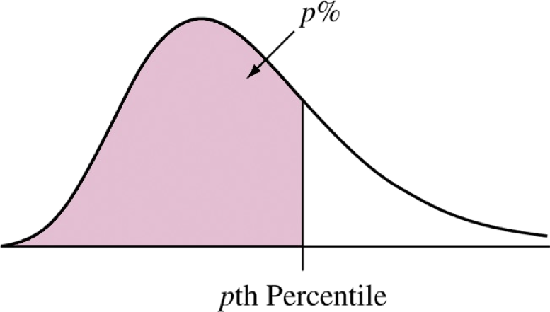
Percentiles
While the variance and standard deviation are computed by how far data are from the mean, percentiles (or quantiles) represent positions in the distribution that have some percentage (or proportion) of the data less than that position.
The 25th percentile is a value that has 25% of the data before it. It also happens to be the median of the data before the actual median (which is the 50th percentile).
The 75th percentile is a value that has 75% of the data before it. It is the median of the data after the actual median.
The 0.1 quantile is a value that has 10% of the data before it. The 0.25 quantile is the same as the 25th percentile.
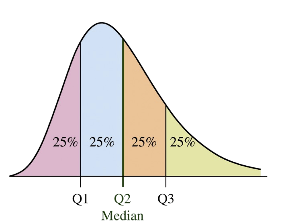
Quartiles
The quartiles split the data into four equal numbers of data points.
\(Q1\) is the first quartile and is the same as the 25th percentile.
\(Q2\) is the second quartile and is the same as the 50th percentile, which is also the median.
\(Q3\) is the third quartile and is the same as the 75th percentile.
Finding Quartiles
To find the quartiles:
Sort the data or organize them in a stem and leaf plot.
Find the median (Q2).
Find the median of the data less than Q2 to find Q1.
Find the median of the data greater than Q2 to find Q3.
R command:
quantile(x)orquantile(x,p).
Note: There are many different rules possible for how to deal with a number of points that does not have equally split.
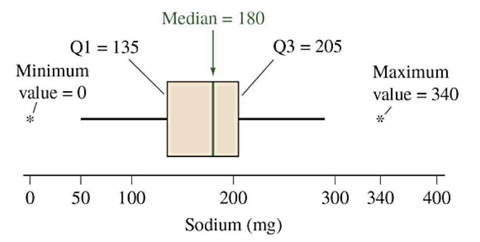
Find the three quartiles for the sodium data (cereal.csv).
Example data: (Source: cereal.csv sodium values)
0, 340, 70, 140, 200, 180, 210, 150, 100, 130,
140, 180, 190, 160, 290, 50, 220, 180, 200, 210
Interquartile Range (IQR)
After defining the percentiles and quartiles, we can define a new measure of variability called the interquartile range (IQR).
For distributions that are not bell-shaped, the IQR can be used to find thresholds for identifying potential outliers.
Values less than \(Q1 - 1.5IQR\) are potential outliers.
Values greater than \(Q3 + 1.5IQR\) are potential outliers.
Box Plots
A box plot (or box and whisker plot) is a graphical representation of the five-number summary for a dataset, (Min, Q1, Q2=Med, Q3, Max). The following description makes a horizontal box plot.
Draw a rectangular bar from Q1 on the left to Q3 on the right. This is the box.
Draw a vertical line inside the box at the median Q2.
Draw a horizontal whisker from the middle of the left side (Q1) to the smallest value that is not an outlier (using the 1.5 IQR rule).
Draw a horizontal whisker from the middle of the right side (Q3) to the largest value that is not an outlier (using the 1.5 IQR rule).
Indicate each outlier (above or below) as individual marks.
boxplot(x). If using ggplot(), then the geometry layer for a box plot is geom_boxplot().Box Plot for Sodium
Example data sorted: (Source: cereal.csv sodium values)
0, 50, 70, 100, 130, 140, 140, 150, 160, 180,
180, 180, 190, 200, 200, 210, 210, 220, 290, 340
Comparison Using Box Plots (Begin Day 8)
I watched the Men’s Super G Alpine Skiing event and wondered how the times compared to older Olympics and chose the 2002 SLC Winter Games. I extracted the run times for the competitors in each race to create this data set: Men’s Super G Times Data.
Olympicscontains the year of the Olympics,Timecontains the time of the race inHH:MM:SS.SSSformat.Must import with extra information about the columns or R drops the fractions of seconds on the times. Use
read_csvwith extra optioncol_types = "ficcc"(columns are: factor, integer, character, character, character).Then convert the
Timecolumn to a time with more precision than the default.
Sample Code for Olympic Box Plot
# Load Libraries: readr, dplyr, lubridate, ggplot2
library(tidyverse)

# Read file forcing character type for Time
superg <- read_csv("link", col_types="ficcc") %>%
  # And then mutate the column by interpreting HMS and then converting to seconds
  mutate(Time = period_to_seconds(hms(Time)))

# Make the plot
ggplot(data = superg, mapping = aes(x=Time, y=Olympics)) +
  geom_boxplot(fill="lightblue") +
  labs(title = "Skier Times for Men's Super G Race")
Sections 2.7: Recognizing and Avoiding Misuses of Graphical Summaries
Key Ideas
Expectations for good graphs: axes, labels, and showing \(y=0\)
Using easily recognized representations: bars, lines or points
Failures to use effective strategies are often difficult to interpret or intentionally deceiving
Guidelines for Effective Graphs
Label both axes and provide proper headings.
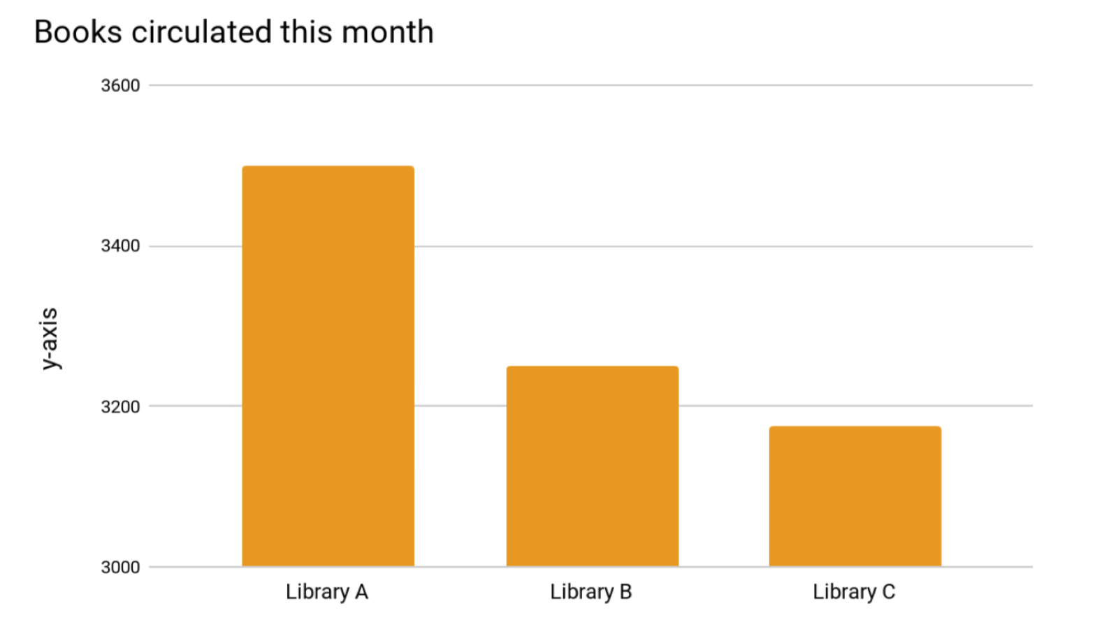
To compare relative size, it is important to show \(y=0\text{.}\)
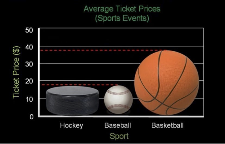
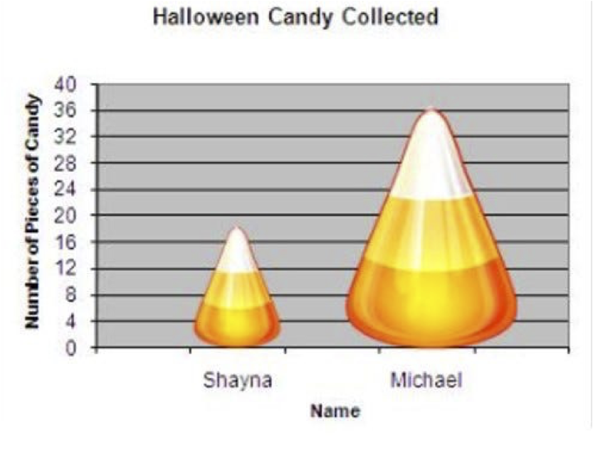
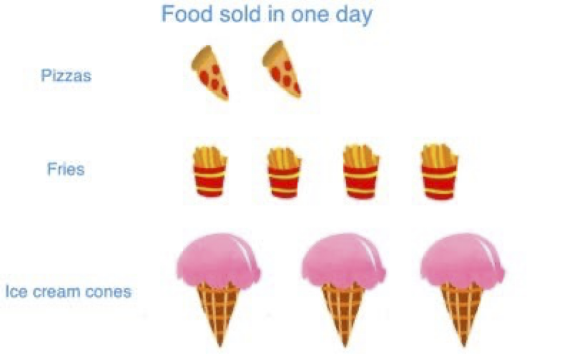
Irregular shapes, especially those using different area are difficult to read. Stick with bars, lines, and points. (This includes pie charts.)
If two different groups have drastically different values, don’t try to put them on a single graph. Consider different graphs, or plot relative sizes such as using percentages or ratios.
Gallery of Poor Graphs, Ex 1
What do you notice about this figure? (Figure 2.19 from Textbook)
Gallery of Poor Graphs, Ex 2
Here is a better graph of the same data. What else could be done? (Figure 2.20 from Textbook)
Gallery of Poor Graphs, Ex 3
Here are three graphs from a Medium blog post about bad graphs. What do you notice?
Source: https://medium.com/@Ana_kin/graphs-gone-wrong-misleading-data-visualizations-d4805d1c4700
Gallery of Poor Graphs, Ex 4
Here is an example from another author showing the number of books circulated at three different libraries. What do you notice?
Source: https://www.lrs.org/2020/06/10/visualizing-data-manipulating-the-y-axis/
Gallery of Poor Graphs, Ex 5
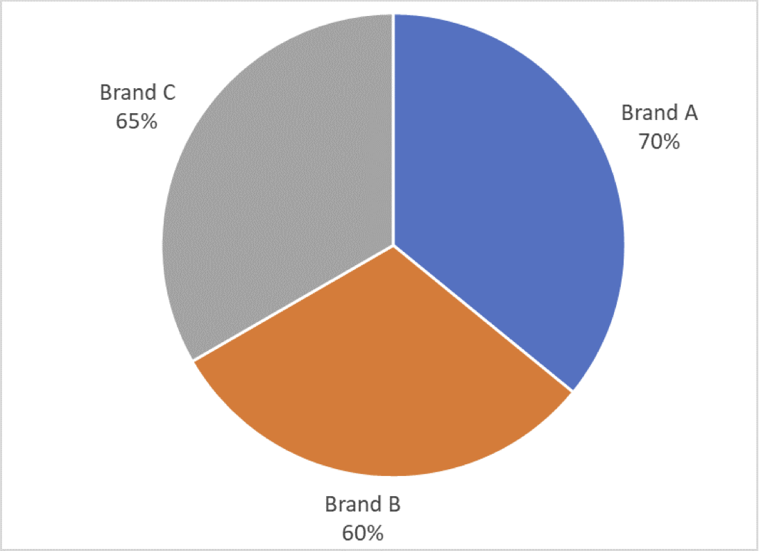
A third blogger gave another example showing brand awareness for three brands as a pie chart. What do you notice here?
Source: https://aspectmr.com/misleading-graphs/
Sections 3.1 and 3.2: Exploring Relationships between Variables
Key Ideas
Associations between Explanatory vs Response Variables
Categorical Variables: Looking for Different Conditional Distributions, Use of Contingency Tables
Measuring difference in proportions using percentage points, percent change, and ratios
Quantitative Variables: Comparing summaries of data, comparing distributions, scatter plot and trends
Linear association, correlation, and regression lines
Associations
Chapter 3 Introduction: The main purpose of data analysis with two variables is to investigate whether there is an association and to describe that association.
An association exists between two variables if particular values for one variable are more likely to occur with certain values of the other variable.
The response variable is the variable whose outcome is being compared. (The algebra idea here would be the dependent variable.)
The explanatory variable is the variable for which we want to see if its value affects the distribution of the response. If there is a cause/effect relation, the cause is usually the explanatory variable.
For a categorical explanatory variable, we consider how the distribution might change for the different categories (factors).
For a quantitative explanatory variable, we consider how the distribution changes with different values.
Identify the Explanatory and Response Variables
Consider the association between carbon dioxide levels and the amount of gasoline use for automobiles.
Consider college students’ GPA values and the number of hours a week spent studying.
Consider food type (organic or conventional) and the presence of pesticides on the food (present or not).
Section 3.1: Association Between Two Categorical Variables
You will need to be able to:
Read and interpret contingency tables
Calculate and interpret proportions and conditional proportions
Create and interpret side-by-side bar charts and stacked bar charts and what we would expect if there is or is not an association
Calculate and interpret the meaning of percentage point difference, percent change, and ratios of proportions to describe associations.
Contingency Tables
A contingency table displays two categorical variables and associated counts for each pair \((x,y)\) possible.
Rows: list the categories of one variable (usually explanatory).
Columns: list the categories of second variable (usually response).
Entries: count or frequency for the combination of variables.
May also have extended table showing row and column sums. These are called the margins.
| Food Type | Pesticide Present | Pesticide Not Present | Total |
|---|---|---|---|
| Organic | 29 | 98 | 127 |
| Conventional | 19,485 | 7,086 | 26,571 |
| Total | 19,514 | 7,184 | 26,698 |
Proportions vs Conditional Proportions
| Food Type | Pesticide Present | Pesticide Not Present | Total |
|---|---|---|---|
| Organic | 29 | 98 | 127 |
| Conventional | 19,485 | 7,086 | 26,571 |
| Total | 19,514 | 7,184 | 26,698 |
A simple proportion for a combination of values is the ratio of a single cell to the overall total.
\begin{equation*} P(\text{conventional and pesticide present}) = \frac{7086}{26698} \approx 0.2654 \end{equation*}A conditional proportion is the ratio a single cell to a row total or column total, depending on which variable is considered given.
\begin{gather*} P(\text{pesticide not present given conventional}) = \frac{7086}{26571} \approx 0.2667 \\ P(\text{conventional given pesticide not present}) = \frac{7086}{7184} \approx 0.9864 \end{gather*}
Table of Conditional Proportions
Treating the row variables as the explanatory variables (conditioned on rows), the conditional proportions can be used to fill a new table. To be complete, we should show the total frequency or sample size for the row to be able to recreate the original table.
| Food Type | Pesticide Present | Pesticide Not Present | |
|---|---|---|---|
| Organic | 0.23 | 0.77 | \(n=127\) |
| Conventional | 0.73 | 0.27 | \(n=26,571\) |
Notice that the sum of each row equals 1.
You should be able to recreate the original counts by multiplying a conditional probability times the sample size \(n\) for the appropriate row.
The variables have an association if the conditional proportions are different for the different rows. There is no association if the conditional proportions are the same.
Visualize with Bar Charts (Begin Day 9)
Side by side bar charts or stacked bar charts are often used to visualize the conditional proportions. See Figs 3.2 and 3.3 from the textbook:
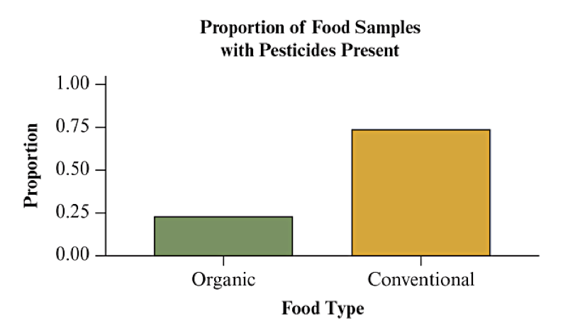
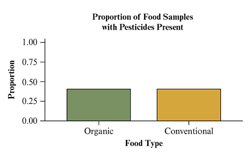
If there is no association, we would expect the proportions to be the same. If there is an association, we would see a different distribution for the two categories.
Comparison by Percentage Points
A difference in proportions or percentages is reported as percentage points. Subtract one percentage from the other.
Comparison Example: Of students who entered JMU in 2018, 79.7% graduated within 6 years. Of students who entered Virginia Tech in 2018, 86% graduated within 6 years.
Because 86%-79.7% = 6.3%, we say Virginia Tech has a graduation rate that is 6.3 percentage points higher than JMU.
Comparison by Percent Change
A percent change is defined by a formula of the change divided by the reference value:
Comparison Example: Of students who entered JMU in 2018, 79.7% graduated within 6 years. Of students who entered Virginia Tech in 2018, 86% graduated within 6 years.
Virginia Tech has a graduation rate that is 7.9% higher than JMU (base value):
JMU has a graduation rate that is 7.3% lower than Virginia Tech (base value):
Comparison by Ratio of Proportions/Percents
A ratio is calculated by simple division of the new value divided by the reference value:
Comparison Example: Of students who entered JMU in 2018, 79.7% graduated within 6 years. Of students who entered Virginia Tech in 2018, 86% graduated within 6 years.
Virginia Tech has a graduation rate 1.079 times the JMU rate (base value):
It is common to report percent change when the ratio is between 0.5 and 2, but to report the ratio directly outside of that range.
Section 3.2: Association Between Two Quantitative Variables
We analyze how the response (dependent) variable tends to change as the value of the explanatory (independent) variable changes. If there is no tendency to change, there is no association.
We usually try to describe the way the variables change with each other through a formula, in which case we say there is a relationship between the variables. (This is more precise than just an association.)
Because data has variability, we will be describing an average or expected relationship. Unusual observations (like outliers) may significantly affect results.
Distributions of Two Quantitative Variables
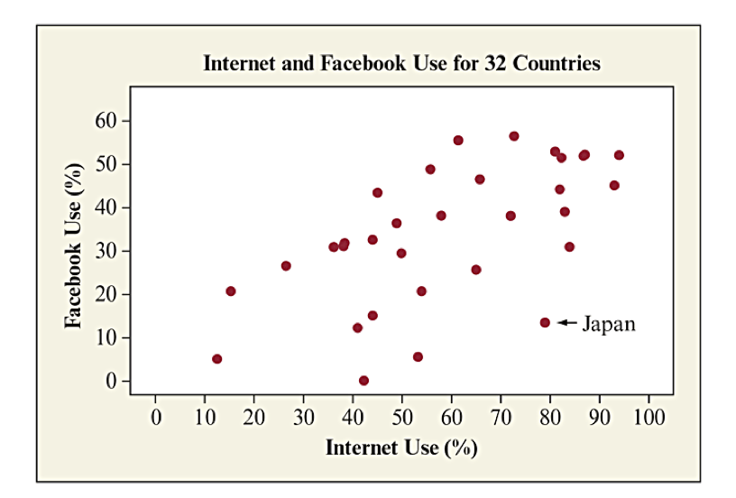
The textbook dataset on "Internet Use" includes internet and Facebook penetration (use) in 32 countries. Looking at their distributions separately is informative, but it does not say anything about their association. (Textbook Figure 3.5)
| Variable | N | Mean | StDev | Min | Q1 | Median | Q3 | Max | IQR |
| Internet Use | 32 | 59.2 | 22.4 | 12.6 | 43.6 | 56.9 | 81.3 | 94.0 | 37.7 |
| Facebook Use | 32 | 33.9 | 16.0 | 0.0 | 24.4 | 34.5 | 47.1 | 56.4 | 22.7 |
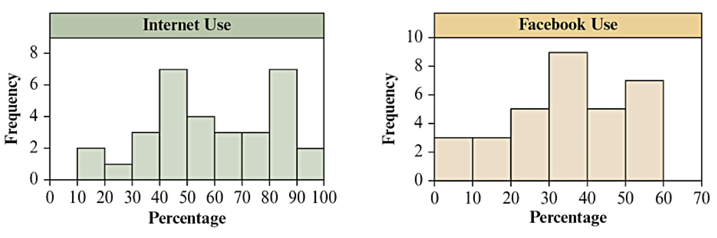
Explore the Data
Here is the link to the data file: Internet Usage (CSV)
Which nations, if any, might be outliers in terms of internet use? in terms of Facebook use?
The Scatterplot: Looking for a Trend
A scatterplot is a graph that will reveal the relationship between two quantitative variables.
In the potential association, each observation consists of a value for each variable.
Horizontal axis: explanatory variable as \(x\) variable
Vertical axis: response variable as \(y\) variable
For each observation, make an \((x,y)\) point and plot it.
Scatterplot for Internet Usage
Textbook Figure 3.6 shows the scatterplot for Facebook Use vs Internet Use. Japan’s values are annotated with an arrow to highlight the point as being significantly below the general trend that is visible.
How to Examine a Scatterplot
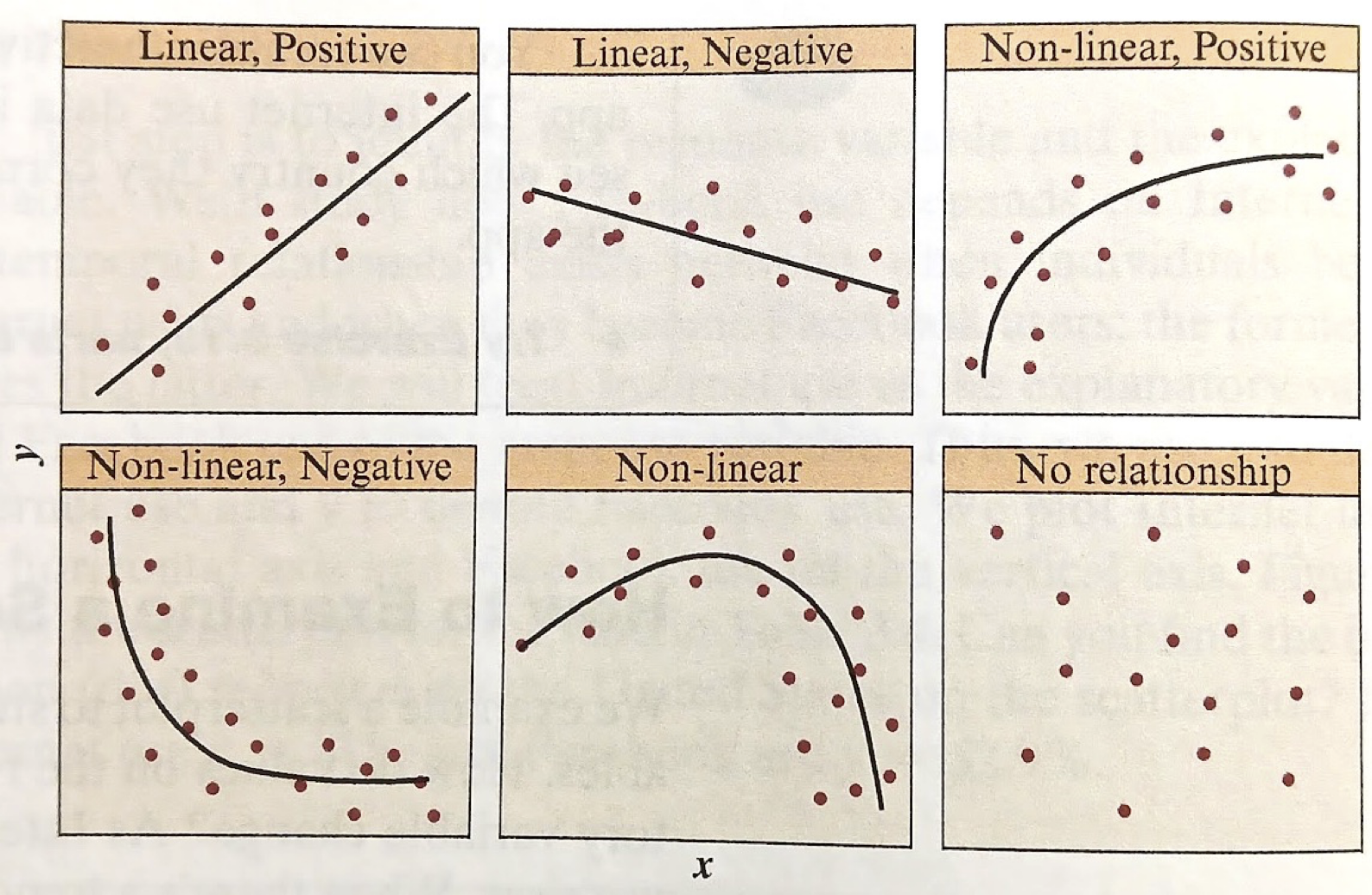
The goal for a scatterplot was to examine the relationship between two variables. We need some terminology for describing our relationship.
Trend: Describing the general shape of the relationship, such as trend is linear, trend is curved or nonlinear, trend shows clusters, or shows no pattern.
Direction: positive, negative, or no direction
Strength: Describes how closely the points fit the trend. A strong relationship has points close to the trend; a weak relationship shows points spread far away from the trend
The word correlation is specifically associated with the strength of a linear relationship. Do not use it for nonlinear relationships or categorical associations.
Trend
Textbook Figure 3.7 illustrates different patterns for trends and direction.
positive relation: the trend for the response variable goes up as the explanatory variable goes up.
negative relation: the trend for the response variable goes down as the explanatory variable goes up.
Strength of Relationship
The strength of the relationship characterizes how closely the response variable matches the trend compared to the overall variability of the explanatory variable. It is observed by how tightly the data points match the trend.
For a linear trend, the (linear) correlation coefficient provides a quantitative measure of strength.
The sign of \(r\) matches the direction of the relationship (positive/negative).
-
The amplitude (absolute value) of \(r\) measures the strength of the association:
\(r \approx 0\) means very weak or no association
\(|r| \approx 1\) is a very strong association.
\(|r| = 1\) means a perfect relation (no variability)
Illustrating Correlation Coefficient
Textbook Figure 3.9 illustrates different correlation coefficients to get a sense of different strengths of associations.
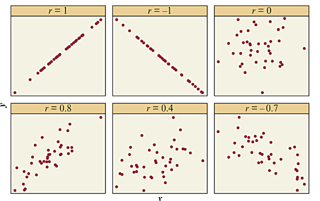
Properties of the Correlation Coefficient
Value of \(r\) always falls between -1 and 1
The sign of \(r\) reveals direction.
Correlation has no units and does not depend on which units were used to measure the variables.
The value of \(r\) does not depend on which variable is explanatory and which is response.
Correlation is not resistant to outliers, and outliers can greatly influence \(r\text{.}\)
As defined, \(r\) only measures the strength of a linear relationship.
Sections 3.3: Linear Regression and Prediction
Key Ideas (Begin Day 10)
-
Goal of regression: find the best relation (formula) to describe the trend.
The best relation is interpreted as minimizing the sum of squared residuals.
For a linear regression, we are generating a trend line using \(\hat{y} = a + b x\text{,}\) where \(a\) and \(b\) are the regression coefficients. You will learn how to interpret the two coefficients.
The values of \(a\) and \(b\) can be calculated from the data. You will learn the formulas and how to use summary statistics to compute them.
You will learn the connection between the correlation coefficient, the slope parameter \(b\text{,}\) and the value of \(r^2\text{,}\) interpreted as proportion of variation explained by the trend line.
Regression Line
Declare variables:
\(x\) refers to the explanatory variable
\(y\) refers to the response variable (actual data)
The regression line is the graph of an equation \(\hat{y} = a + b x\text{.}\)
\(a\) = \(y\)-intercept, or predicted value when \(x=0\)
\(b\) = slope, or value \(\hat{y}\) changes per unit change in \(x\)
Using the Regression Line
The regression model allows us to take any value of \(x\text{,}\) evaluate the formula, and the resulting value is \(\hat y\text{,}\) the predicted value for \(y\) associated with \(x\text{.}\)
Actual values \(y\) have variation away from \(\hat y\)
Predictions are more reliable in the middle of regions with data.
Extrapolation is when we use a model outside of the regions with data. The further away from the data, the less reliable the prediction.
Example: Height Based on Human Remains
Description of the model:
\(x\) = length of a femur (thigh bone) in centimeters.
\(y\) = height of subject in centimeters.
\(\displaystyle \hat y = 61.4 + 2.4 x\)
Interpretation:
Use the regression equation to predict the height of a person whose femur length was 50 cm.
Identify and interpret the y-intercept.
Identify and interpret the slope.
Slope and Direction
The sign of the slope is the same as the direction of the linear relationship:
\(b > 0\) means there is a positive relationship
\(b < 0\) means there is a negative relationship
\(b = 0\) means there is a no association
Question: Would you expect a positive or negative slope when \(y\)=annual income and \(x\)=number of years of education?
Residuals
For each actual data point \((x,y)\text{,}\) we can calculate the predicted value \(\hat y\text{.}\) Each point has a corresponding residual:
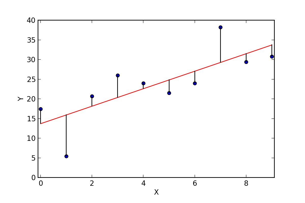
A large residual means the data point is far away from the trend line.
A small residual means the data point is close to the trend line so that the predicted value is a good approximation.
Principle of Least Squares
For any line \(\tilde{y} = A + B x\text{,}\) we can compute the residual sum of squares,
Always will be some positive and some negative residuals
Sum of residuals will always be zero (0)
Regression line always passes through \((\overline x, \overline y)\)
Formula for Coefficients
Need to know: \(\overline x\) (x mean) and \(s_x\) (x standard deviation), \(\overline y\) (y mean) and \(s_y\) (y standard deviation), and \(r\) (correlation coefficient).
In R, if we have data frame df with a vector of values for \(x\) in x_var and a vector of values for \(y\) in y_var, we can find the model: lm(y_var ~ x_var, data=df).
The \(r\)-Squared Correlation
Remarkably, we also have a relation between \(r^2\) and the deviation sum of squares:
-
\(r^2 = 1\) means 100% of the variation from the mean is explained by the regression line.
\(r^2 = 0.7\) means 70% of the variation from the mean is explained by the regression line.
\(r^2 = 0\) means 0% of the variation from the mean is explained by the regression line (no relation).
Sections 3.4: Cautions in Analyzing Associations
Key Ideas (Begin Day 12)
Extrapolation is dangerous!
Be cautious of influential outliers
Correlation (or Association) does Not imply Causation
Lurking variables and confounding variables affect associations and can lead to apparent paradox situations.
Extrapolation is Dangerous
Reminder: extrapolation is when we use the regression line to make predictions for \(x\)-values outside the observed range of values.
Riskier the farther we move from the range
No guarantee the relationship will continue to be linear
Influential Outliers
A regression outlier is an observation that lies far away from the trend relative to other data points. You should always plot the data to see if there might be outliers or other unusual observations.
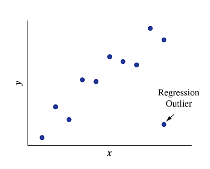
An outlier is an influential outlier if:
its \(x\)-value is relatively high or low compared to the remainder of the data (far from center horizontally)
its \(y\)-value is relatively far from the trend compared to the remainder of the data
Effect of Influential Outliers
The effect of influential outliers is to pull the regression line toward that data point and away from the rest of the data points. It tends to make the slope steeper than it would be without that observation.
Textbook Figure 3.19: Which outlier is influential?
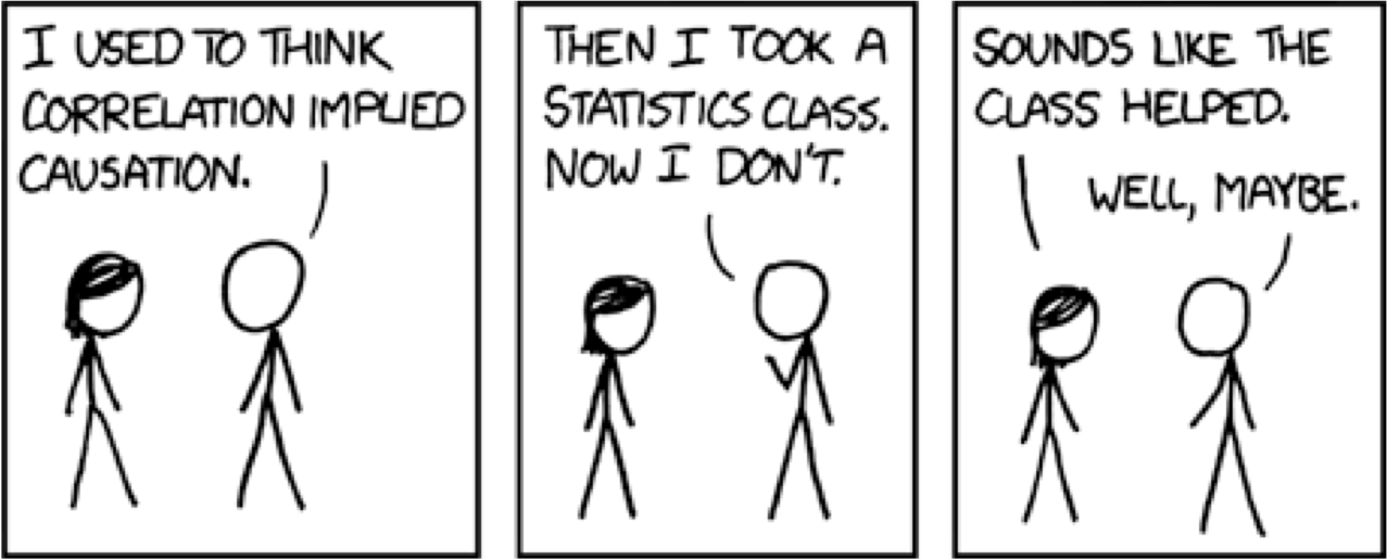
Correlation Does Not Imply Causation
In a regression analysis, suppose that as \(x\) goes up, \(y\) also tends to go up (or down). Can we conclude that there is a causal connection, with changes in \(x\) causing changes in \(y\text{?}\)
NO!
A strong correlation between \(x\) and \(y\) means that there is a strong linear association that exists between the two variables.
A strong correlation between \(x\) and \(y\) does not mean that \(x\) causes \(y\) to change.
Examples of suspicious associations:
High correlation between monthly ice cream sales and monthly drownings
High correlation between shoe size and reading level
Lurking Variables
A lurking variable is a variable, usually unobserved, that influences the association between the variables of primary interest.
Lurking variables often capture a hidden link that explains the correlation:
Ice cream sales and monthly drownings more likely in hot weather
Shoe size and reading level both increase with age
Lurking Variables and Confounding
In practice, there are multiple causes for outcomes, often related to one another. It can be difficult to study the effect of individual variables.
When two explanatory variables are both associated with a response variable but are also associated with each other, there is said to be confounding.
Lurking variables are not measured in a study. They have the potential to be confounding if they were measured.
Time is Common Confounding Variable
Association Does Not Imply Causation
Simpson’s Paradox
A paradox refers to an apparent contradiction.
Simpson’s paradox occurs when the direction of an association between two variables changes after we include a third variable (often categorical) and analyze the data at separate levels of that third variable.
Baseball example: Compare the 1995 and 1996 batting averages for Derek Jeter and David Justice. If we combine the years, the order reverses.
| Batter | ’95 Hits | ’95 At Bats | ’95 Batting Ave | ’96 Hits | ’96 At Bats | ’96 Batting Ave | Combined Batting Ave |
| Derek Jeter | 12 | 48 | 0.250 | 183 | 582 | 0.314 | 0.310 |
| David Justice | 104 | 411 | 0.253 | 45 | 140 | 0.321 | 0.270 |
Smoking and Health
A longitudinal study about smoking followed 1,314 women, 582 of whom smoked and 732 of whom did not. The study recorded how many of these individuals were still alive 20 years later.
| Smoker | Dead | Alive | Total |
|---|---|---|---|
| Yes | 139 | 443 | 582 |
| No | 230 | 502 | 732 |
| Total | 369 | 945 | 1,314 |
Is there an association between the variables? Does survival favor smokers or non-smokers?
Smoking and Health: Conditional Proportions
To compare categories, we need to look at the conditional proportions given the smoking status.
| Smoker | Dead | Alive |
|---|---|---|
| Yes | 23.88% | 76.12% |
| No | 31.42% | 68.58% |
What conclusion can we draw?
Smoking and Health: Lurking Variables
Age is a lurking variable in our analysis. The summary grouped all ages together, but death is more likely for the older population. Different age groups also had different proportions that smoked.
| Smoker | Age-Group | Dead | Alive | Survivor | Smoking + Age Group |
| Yes | 18-34 | 5 | 174 | 97.21% |
| No | 18-34 | 6 | 213 | 97.26% |
| Yes | 35-54 | 41 | 198 | 82.85% |
| No | 35-54 | 19 | 180 | 90.45% |
| Yes | 55-64 | 51 | 64 | 55.65% |
| No | 55-64 | 40 | 81 | 66.94% |
| Yes | 65+ | 42 | 7 | 14.29% |
| No | 65+ | 165 | 28 | 14.51% |
Section 4.1: Experimental and Observational Studies
Key Ideas
Chapter 4 is about how data are collected and how that influences what types of conclusions we can create.
Two broad classes of studies: experimental studies and observational studies
Be able to identify whether a study was experimental or observational.
Discuss advantages and challenges of each type of study.
Experimental Studies
In an experimental study, a researcher assigns subjects to experimental conditions and then observes the response variables.
The assigned experimental conditions are called treatments.
Observational Studies
In an observational study, a researcher observes the values of both the explanatory variables and the response variable for all study subjects.
Nothing is done to the subjects. They are just observed.
Identify the Study Type: Drug Testing and Student Drug Use
A headline read: “Student Drug Testing Not Effective in Reducing Drug Use” in a news release from the University of Michigan.
Facts about the study:
76,000 students nationwide
497 high schools, 225 middle schools
Some included schools tested for drugs, others did not
Each student filled out a questionnaire about his/her drug use
Data Summary: Drug Testing and Student Drug Use
| Drug Tests? | Drug Use Yes | Drug Use No | Total |
|---|---|---|---|
| Yes | 2,092 | 3,561 | 5,653 |
| No | 6,452 | 10,985 | 17,437 |
Was this an observational study or an experiment?
What is the question?
What is the explanatory variable? What is the response variable?
Comparison of Advantages/Challenges
Lurking variables
Observational study: The researcher is at the mercy of how they are distributed among the subjects.
Experiment: Randomization during treatment assignment can reduce potential for impact.
Cause and effect
Observational study: Might find an association, but association does not imply causation.
Experiment: Directly manipulating treatments allows research to study effect of explanatory variable.
Practicalities
Not ethical to expose some subjects to something that we suspect might be harmful (assign treatment), but observations of existing exposure is reasonable.
Subjects can be unreliable to follow a treatment protocol, especially over long time periods. Observing behavior does not require strict control.
Experiment may take too long, but observation can look at older records.
Cautions about Anecdotes
Informal observations are called anecdotes.
There is no way to determine if anecdotes are representative of what happens for an entire population. “The plural of anecdote is not data”
Do not draw conclusions from anecdotal evidence. Reputable studies adopt methodologies to ensure that their data is representative.
Section 4.2: Good and Poor Ways to Sample (Begin Day 13)
Key Ideas
A sample survey selects a sample of people from a population and collects data from them (observational study). Contrast this with a census which aims to collect data from every member of a population.
We will learn about how sampling should occur to get good results
Understand sampling frame and sampling design
Understand a simple random sample and how to perform it in practice
Sources of bias in surveys and the different types of bias.
Cautions about sampling strategies
Purpose of Randomness
When we want to draw conclusions from the results of a survey (inference), we need to know that the sample is representative of the population.
Proportions observed in the sample should be close to proportions of reality. If we randomly select subjects from the population, then with a large enough sample, the distributions from our sample will resemble the distributions from the population.
A mismatch between the distributions of our sample and that of the population is called bias and results in estimates and conclusions that are invalid.
Sampling Design
The sampling frame is the list of all subjects that can be selected.
Ideal: every individual in the population is listed
Practice: can be difficult to identify every individual
The sampling design is the strategy used to select subjects for the sample. The sample size is the number of subjects in the sample and is often denoted by the symbol \(n\text{.}\)
Simple Random Sampling
A simple random sample of size \(n\) is one in which every potential sample of size \(n\) has the same probability of being selected. It is often simply called a random sample.
Strategy:
Number all subjects in the sampling frame (1, 2, 3, etc.).
Generate a set of numbers randomly. In R, use
sample(N,n), where \(N\) is the size of the sampling frame and \(n\) is the size of the sample.Sample the subjects that correspond to the numbers.
Collecting Survey Data
For surveys of people, it is especially difficult to get a good sampling frame because a list of all adults in a population rarely exists (and is often changing). So we pick an alternative:
Use addresses (place of residence), such as US Census
Use telephone numbers
Other methods?
Once we identify individuals, how do we get answers?
Interview in person
Interview by telephone
Self-administered questionnaire
Sources of Bias
When results from the sample are not representative of the population, they are said to exhibit bias. When the source of the bias is because of how the sample was chosen, it is sampling bias.
Undercoverage bias: having a sampling frame that lacks representation from some parts of the population.
Nonresponse bias: some subjects cannot be reached or refuse to participate or fail to answer some questions.
Response bias: some subjects give an incorrect response (perhaps lying) or the way the questions are asked is confusing or misleading.
Famous Election Polling Errors
1936 Roosevelt vs Landon; Literary Digest predicted Landon would win in a landslide
1948 Truman vs Dewey; Early use of telephone surveys, premature end of polling
Photos of Alfred Landon and Thomas Dewey courtesy Wikipedia

Poor Ways to Sample
Convenience Sample: a type of survey sample that is chosen because it is easy to obtain at low cost.
Unlikely to be representative
Often results in severe biases
Results apply only to the observed subjects
Volunteer Sample: example of convenience sample where subjects volunteer
Volunteers do not tend to be representative of the entire population
Internet surveys are often volunteer samples. Even with large sample sizes, the sample is not representative.
A Large Sample Size Does Not Guarantee an Unbiased Sample
Key Parts of a Sample Survey
Identify the population of all subjects of interest.
Define a sampling frame which attempts to list all subjects.
Use a random sampling design to select \(n\) subjects.
Be cautious about sampling bias, response bias, and non-response bias.
We can make inferences about the population when random sampling is used.
Other Sampling Strategies (Section 4.4)
Using simple random sampling requires that the sample size is big enough that all parts of the population are adequately sampled. This can result in some parts of the population being oversampled compared to others. We can create alternative sampling designs that can be more efficient and less expensive.
Cluster random sampling: Identify clusters of subjects instead of actual subjects. Select a random sample of clusters and survey all subjects in chosen clusters.
Stratified random sampling: Divide the population into separate groups based on some attribute, which are called strata Select a simple random sample of subjects from each stratum.
Cluster Random Sampling
Identify clusters of subjects instead of actual subjects. Select a random sample of clusters and survey all subjects in chosen clusters. (See textbook Figure 4.2)
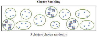
Examples of clusters:
Geography: counties, census tracts
Buildings: nursing homes, hospitals, apartments
Cluster Random Sampling: Advantages and Disadvantages
Advantages:
Preferable if a reliable sampling frame is not available.
Preferable if cost of selecting a simple random sample is excessive.
Disadvantages:
Usually requires a larger sample size compared to a comparable precision from a simple random sample.
Selecting a small number of clusters might not be representative of the population (homogeneous = lacks diversity)
Stratified Random Sampling
Divide the population into separate groups based on some attribute, which are called strata Select a simple random sample of subjects from each stratum. (See textbook Figure 4.2)
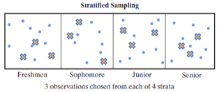
Examples of strata:
Student status: freshmen, sophomores, juniors, seniors
Employment status: unemployed, part time, full time hourly, full time contract
Income levels: below poverty, lower class, middle class, upper class
Stratified Random Sampling: Advantages and Disadvantages
Advantages:
Can include in your sample enough subjects in each group you want to evaluate.
Disadvantages:
Must have a sampling frame and know the stratum into which each subject belongs
Section 4.3: Good and Poor Ways to Experiment
Key Ideas
An experiment assigns a treatment to each experimental unit (subject)
We will learn about key elements of experimental design
Control group and treatment groups
Role of randomization and generalization
Placebo effect and blinding studies
Treatments
To avoid just collecting anecdotes, the researcher needs to assign different treatments to different groups in order to make comparisons.
Treatment: An experimental condition that is assigned to experimental units.
Control: A treatment that is neutral or is expected to result in no change.
Goal: Investigate an association by exploring how the treatment affects the response. Provides stronger evidence for causation.
The explanatory variable corresponds to the values the treatment changes and defines the groups to be compared. The response variable corresponds to the measured outcome or result of the experiment.
Placebos
We need to separate the response to receiving a treatment from the result of the treatment. The subjects should still be given something, just without active ingredients, called a placebo.
ingestion of sugar pills
injection of saline solution
fake surgical procedures
Ethical considerations might require the control group receives an existing baseline treatment instead of no treatment because we minimize added risk to human subjects for participation in experiments.
Randomization in Experiments
Lurking variables also exist in experiments. We want to compare results of different treatments, but don’t want the influence of lurking variables to introduce bias. Assignment of treatments is randomized.
Balance groups on variables that you know affect the response.
Balance groups on lurking variable that may be unknown
Prevent assignment bias where one treatment might be given to favorable group.
Textbook example: An analysis of published medical studies about treatments for heart attacks indicated that the new therapy provided improved treatment 58% of the time in studies without randomization and control groups but only 9% of the time in studies having randomization and control groups.
Blinding Studies (Begin Day 14)
The placebo effect is where people who take a placebo respond better than those who receive nothing, perhaps for psychological reasons. To control for the placebo effect, we don’t want participants to know which treatment they are receiving. This is called a blinded study.
We also do not want researchers to treat different groups differently as that can also bias the results. When the researchers who interact with subjects also do not know which treatment is being administered, it is a double blinded study. Triple blinding occurs when data analysts are also blinded to the assigned treatment.
Experiment Example: Quit Smoking
Studies have reported that regardless of what smokers do to quit, most relapse within a year. Some scientists have suggested that smokers are less likely to relapse if they take an antidepressant regularly after they quit.
Suppose you have 400 volunteers who would like to quit smoking? How can you design an experiment to study whether antidepressants help smokers to quit?
Generalizing Results
Recall that the goal of experimentation is to analyze the association between the treatment and the response for the population, not just the sample. However, care should be taken to generalize the results of a study only to the population that is represented by the study.
Textbook Exercise 4.34 (Vitamin B): A New York Times article (March 13, 2006) described two studies in which subjects who had recently had a heart attack were randomly assigned to one of four treatments: placebo and three different doses of vitamin B. In each study, after years of study, the differences among the proportions having a heart attack were reported. Identify the (a) response variable, (b) explanatory variable, (c) experimental units, (d) the treatments in this study, and (e) the population for whom results might generalize.
Multifactor Experiments
A multifactor experiment uses a single experiment to analyze the effects of two or more explanatory variables on the response variable. Categorical explanatory variables in an experiment are called factors. Multifactor experiments can be more informative because the response might vary for different factor combinations through interactions.
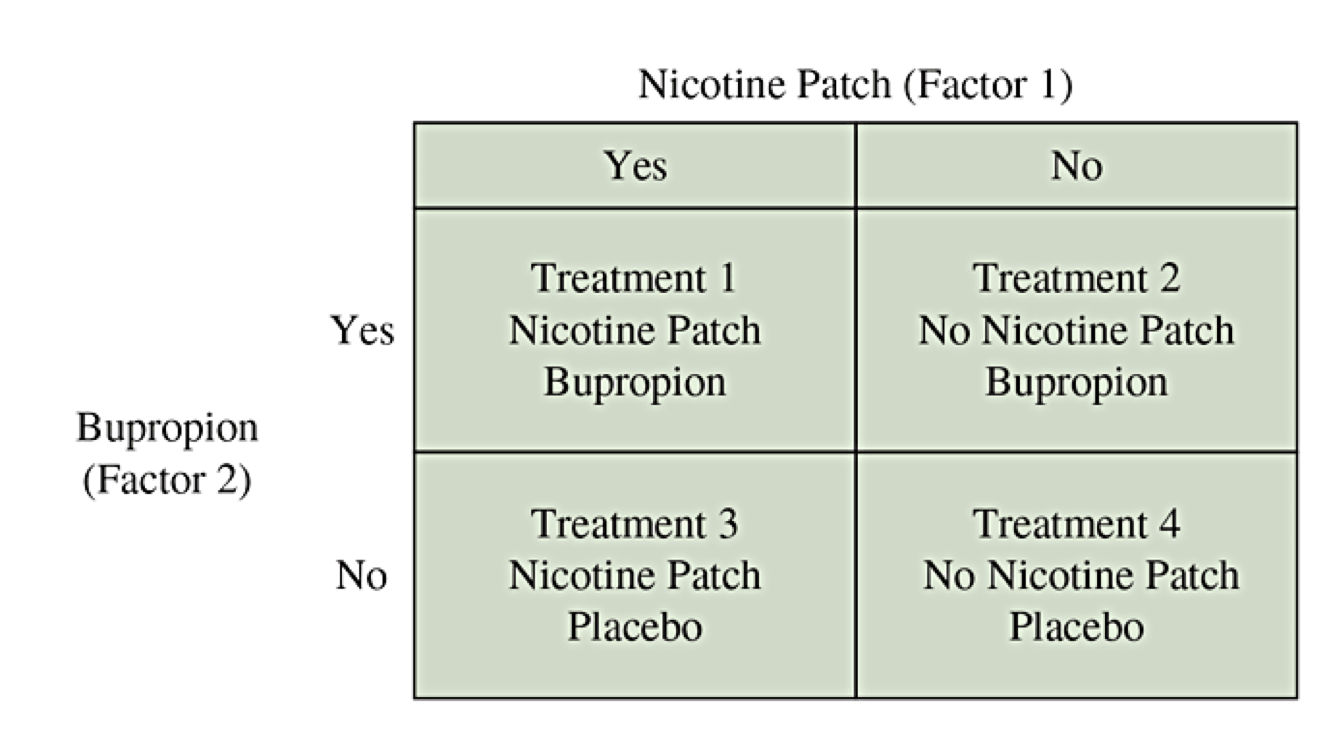
Multifactor Smoking Example
Antidepressants and nicotine patches both might help individuals stop smoking.
Why use both factors at once?
Why not do one experiment about bupropion and a separate experiment about the nicotine patch?
Matched Pairs Design
In a matched pairs design experiment, each subject undergoes both treatments sequentially. They start with one treatment and then cross over to the other treatment.
Can remove certain forms of bias
Each pair of observations involve the same lurking variables
The focus is on the change of the response variable.
Blocking Design
A block is a set of experimental units (aka subjects) that are matched with respect to one or more characteristics.
A randomized block design is when we separate experimental units into blocks and then randomly assign treatments separately within each block.
Chapter 5: Overview of Probability Ideas
Key Ideas
Probability gives a framework for describing randomness.
We will learn about key elements of probability
Vocabulary: sample space, event, set notation
Basic properties and rules of probability (union, intersection, complement)
Conditional probability, sequential events, and independence
Bayes Theorem: reversing the sequential thinking
Simple Randomness
Probability is the mathematical framework for studying random events.
Our intuition begins by thinking about simple random events: counting equally likely possibilities.
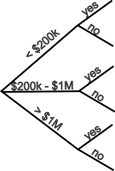
The following contingency table categorizes taxpayers (in thousands) according to their income level and whether their taxes were audited.
| Income Level | Audited=Yes | Audited=No | Total |
|---|---|---|---|
| Under $200,000 | 839 | 141,686 | 142,525 |
| $200,000-$1,000,000 | 72 | 6,803 | 6,875 |
| More than $1,000,000 | 23 | 496 | 519 |
| Total | 934 | 148,986 | 149,919 |
Need to Generalize
Not every possibility for every random event of interest is equally likely. We need to create a method to generalize the ideas.
Sample Space: The set of all possible elementary outcomes, usually \(S\) or \(\Omega\text{.}\)
Event: A subset of the sample space for which we can find probabilities.
Set Notation: When we can list possible outcomes, a set is written with curly braces { } and the outcomes separated by commas. Alternatively, we can state a rule inside the curly braces for what it means to belong.
Probability of Event: For each event, which is a subset \(A\text{,}\) we will define the probability \(P(A)\) as a number from 0 to 1.
Tax Return Example, Revisited
| Income Level | Audited=Yes | Audited=No | Total |
|---|---|---|---|
| Under $200,000 | 839 | 141,686 | 142,525 |
| $200,000-$1,000,000 | 72 | 6,803 | 6,875 |
| More than $1,000,000 | 23 | 496 | 519 |
| Total | 934 | 148,986 | 149,919 |
Define the sample space, several events of interest, and state the probabilities of those events using \(P(A)\text{.}\)
Probability Rules
First, we have basic rules of probability.
An event can be empty, \(A = \emptyset = \{ \}\text{:}\) \(P(\emptyset) = 0\)
An event can be everything, \(A = S\text{:}\) \(P(S) = 1\)
For every event \(E\text{:}\) \(0 \le P(E) \le 1\)
Second, we need rules for combining events. Let \(A\) and \(B\) be two events (i.e., subsets).
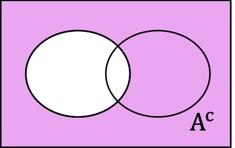
The complement of an event \(A\text{,}\) written \(A^c\) or \(A'\text{,}\) is every outcome that is not in the event. This is the sample space with outcomes in \(A\) removed.
\begin{equation*} P(A^c) = 1 - P(A) \end{equation*}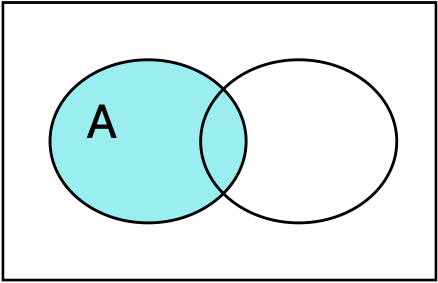
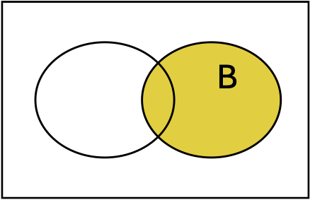
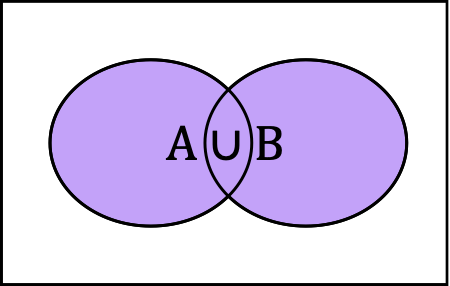
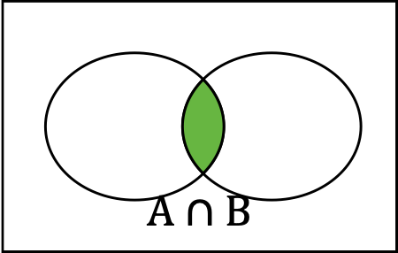
Union and Intersection
The union of \(A\) and \(B\text{,}\) written \(A \cup B\text{,}\) is every outcome that is in at least one of the sets. This is the sum of the outcomes, counting any duplicates only once.
The intersection of \(A\) and \(B\text{,}\) written \(A \cap B\text{,}\) is every outcome that is in both of the sets. This is the set of overlapping outcomes.
Probability of Unions (A or B)
Two events \(A\) and \(B\) are said to be disjoint if \(A \cap B = \emptyset\) (empty overlap). For any two disjoint sets, we have
\begin{equation*} P(A \cup B) = P(A) + P(B) \end{equation*}More generally, if the sets are not disjoint, we can’t double count outcomes, so\begin{equation*} P(A \cup B) = P(A) + P(B) - P(A \cap B) \end{equation*}
Tax Return Example, Revisited for Union
| Income Level | Audited=Yes | Audited=No | Total |
|---|---|---|---|
| Under $200,000 | 839 | 141,686 | 142,525 |
| $200,000-$1,000,000 | 72 | 6,803 | 6,875 |
| More than $1,000,000 | 23 | 496 | 519 |
| Total | 934 | 148,986 | 149,919 |
Find the probability that:
a tax return reflects an individual in the lowest or the highest bracket.
a tax return reflects an individual in the lowest in come bracket or that the individual’s return is audited.
Conditional Probability (Begin Day 15)
Conditional probability occurs when we are calculating a probability restricted to a given event. We treat that given event as if it were the new sample space and only consider outcomes that would be in that event. This requires using intersection.
Let \(A\) and \(B\) be two events. We define the conditional probability of \(A\) given \(B\) as the probability of outcomes in A when we know we are restricted to B:
Tax Return Example, Revisited for Conditional Probability
| Income Level | Audited=Yes | Audited=No | Total |
|---|---|---|---|
| Under $200,000 | 839 | 141,686 | 142,525 |
| $200,000-$1,000,000 | 72 | 6,803 | 6,875 |
| More than $1,000,000 | 23 | 496 | 519 |
| Total | 934 | 148,986 | 149,919 |
Find the conditional probability that:
a tax return is audited given that the tax payer is in the lowest bracket.
a tax return is in the lowest bracket given that the tax return is audited.
Probability of Intersection Using Conditional Sequences
The definition of conditional probability can be rewritten as a product:
It could have also been defined symmetrically:
Tax Return Example, Sequential Thinking
| Income Level | Audited=Yes | Audited=No | Total |
|---|---|---|---|
| Under $200,000 | 839 | 141,686 | 142,525 |
| $200,000-$1,000,000 | 72 | 6,803 | 6,875 |
| More than $1,000,000 | 23 | 496 | 519 |
| Total | 934 | 148,986 | 149,919 |
Use sequential reasoning to find the conditional probability that:
a tax return is audited given that the tax payer is in the highest bracket.
a tax return is in the highest bracket given that the tax return is audited.
Diagnostic Testing
Tests to determine the presence of an illness, a drug, or other condition are called diagnostic tests. The success rates for the test are defined using conditional probabilities which are given specific names.
Sensitivity is the conditional probability to successfully detect the condition given that is is actually present.
Specificity is the conditional probability that the test successfully responds negatively given the condition is actually absent.
COVID Test Accuracy
COVID rapid antigen tests have an average sensitivity of 69.3% and an average specificity of 99.3%. Suppose COVID is actively spreading so that 5% of the population is currently infected.
Fill out the contingency table for conditional probabilities based on sensitivity and specificity.
Fill out the contingency table for probabilities of each joint state.
Independence (Begin Day 16)
Two events \(A\) and \(B\) are independent if
Independence means that the events are not associated. Knowing if an outcome is in one event does not give you any information on whether it is more or less likely that the outcome is in the other event.
Do not assume that two events are independent unless you have clear reasons for believing this. You should by default use sequential reasoning and conditional probabilities.
Random Guessing on Quiz
Consider a 3 question multiple choice quiz. Each question has 5 possible answers. Suppose you randomly guess on each question, so that your guessing the correct answer on any given question is independent of the other questions.
Find the probability that I pass the test (at least 2 out of 3 correct).
Chapter 6: Overview of Random Variables
Key Ideas
Random variables are the mathematical formulation for describing variables that are subject to random variability at the population level.
We will learn about following key ideas:
Vocabulary: random variable, distribution, continuous vs discrete
Calculating expected values (mean, variance, standard deviation)
Key properties of binomial random variables
Random Variables
A random variable is a way to assign a numeric value to each outcome in the sample space, so that randomly selecting an outcome corresponds to a number.
Example: Flip a coin 3 times and record flips (Heads or Tails)
Sample space: collection of all possible (\(2 \cdot 2 \cdot 2 = 8\)) sequence of flips \(\{ HHH, HHT, HTH, HTT, THH, THT, TTH, TTT \}\)
Random variable: How can we assign a number to each outcome?
Number of heads
Maximum number of consecutive sequence of heads
Number of heads minus number of tails
Distribution of Discrete Random Variables
A random variable for which we can list all of the possible values is called discrete. If the random variable can take any value from an interval, it is called continuous.
The distribution of a discrete random variable is the function defining probabilities associated with each of the possible values for the variable. We usually use \(p(x)\) where \(p\) is the distribution function (called the probability mass function) and \(x\) represents a possible value.
Example: For each random variable defined on the three coin flips sample space, describe the distribution of the random variables.
\(X\) = number of heads
\(Y\) = maximum number of consecutive heads
\(Z\) = number of heads minus number of tails
Expected Value (Mean)
Given a random variable \(X\text{,}\) we can define the expected value of \(X\) as the theoretical mean (population parameter), usually written \(\mu_X\) or just \(\mu\) (if there is only one variable). We can also use the expectation operator that calculates the expected value, written \(E[X]\text{.}\)
The expected value is calculated by adding over all possible variable values the value of \(X\) times the probability it has that value.
Example: For the 3 coin flips, calculate \(\mu\) for the number of heads.
Example: For a roll of a single 6-sided die, calculate \(\mu\) for the number of pips (dots) on the top face.
Expected Variance (or just Variance)
Recall that for a sample, we can compute the sample variance as an average squared deviation. For a random variable representing a theoretical population, we can compute the variance (parameter), usually written \(\sigma^2\) or \(\sigma_X^2\) using expectation.
Calculating Variance and Standard Deviation
Example: For the 3 coin flips, we found \(\mu = 1.5\) for the number of heads. Find the variance \(\sigma^2\) and standard deviation \(\sigma\text{.}\)
Example: For a roll of a single 6-sided die, we found \(\mu = 3.5\text{.}\) Find the variance \(\sigma^2\) and standard deviation \(\sigma\text{.}\)
Mega Millions Jackpot
On October 2, 2025, the Virginia MegaMillions lottery had a jackpot value worth $520 million. Each ticket costs $5. The lottery website identified the possible prizes along with their probabilities for winning.
Find the expected value of the net winnings (value of prize won minus cost of ticket).
| Prize | Value | Probability |
| 5 of 5 + MegaBall | $520,000,000 | 1/290,472,336 |
| 5 of 5 | $1,000,000 | 1/12,629,232 |
| 4 of 5 + MegaBall | $10,000 | 1/893,761 |
| 4 of 5 | $500 | 1/38,859 |
| 3 of 5 + MegaBall | $200 | 1/13,965 |
| 3 of 5 | $10 | 1/607 |
| 2 of 5 + MegaBall | $10 | 1/665 |
| 1 of 5 + MegaBall | $7 | 1/86 |
| MegaBall | $5 | 1/35 |
Continuous Random Variables
A random variable is called continuous when its possible values form an interval.
Examples: time, age, and size measures such as height and weight.
Continuous variables are usually measured in a discrete manner because of rounding.
The distribution of a continuous random variable can not assign probability to individual values. (Paradox: The only way that might make sense is that any specific value has probability 0.) Instead, we define probabilities for intervals in which the value can belong instead of individual values.
Density Functions
To fully understand this idea, we would need calculus. But for continuous random variables, there is a function called the density that is always positive (or zero) such that the area under its graph is exactly equal to 1.
If \(X\) is our random variable, then \(P(a \le X \le b)\) will be equal to the area under the density’s graph in the interval \(a \le x \le b\text{.}\)

Normal Random Variables
The most important continuous random variable is said to follow the normal distribution and has the fundamental bell-shaped distribution. A normal distribution can be defined with any mean \(\mu\) and standard deviation \(\sigma\text{.}\)
The graph is symmetric around \(x=\mu\) and the width of the bell is proportional to \(\sigma\text{.}\)

The Standard Normal
For any normal random variable with mean \(\mu\) and standard deviation \(\sigma\text{,}\) which is indicated by writing \(X \sim N(\mu,\sigma)\text{,}\) we normalize by finding
In order to calculate probabilities for \(X\) to be in \(a \lt X \lt b\text{,}\) we calculate the z-value for \(a\) and \(b\) and use the standard normal distribution.
Cumulative Tail Probabilities
(Start Day 17) The left-tail probability is defined by a probability \(P(X \lt a)\text{.}\) The right-tail probability is defined by a probability \(P(X \gt a)\text{.}\) Single numbers have no probability, \(P(X = a) = 0\text{.}\)


Using the probability rule for complements and for disjoint events:
Calculate Probabilities
The left-tail probabilities for the standard normal distribution are calculated and recorded in tables (called cumulative probability). We can use standardization and these tables to calculate other probabilities.
For \(X \sim N(0,1)\text{,}\) find \(P(0 \lt X \lt 1)\text{.}\)
For \(X \sim N(0,2)\text{,}\) find \(P(1 \lt X \lt 3)\text{.}\)
For \(X \sim N(2,3)\text{,}\) find \(P(-2 \lt X \lt 2)\text{.}\)
Quantiles and Percentiles
When we have a distribution (discrete or continuous), we can find quantiles or percentiles.
Given a random variable \(X\) and a proportion \(p\) with \(0 \lt p \lt 1\text{,}\) the \(p\) quantile is the value \(x\) so that \(P(X \le x) = p\text{.}\) Multiplying \(p\) by 100, \(100p\) is a percentage and so we also call \(x\) the \(100p\)th percentile.
We can read the probability table to also find quantiles of a standard normal distribution.
Find the \(0.8\) quantile of \(Z \sim N(0,1)\text{.}\)
Find the \(0.95\) quantile of \(Z \sim N(0,1)\text{.}\)
Find the 12th percentile of \(Z \sim N(0,1)\text{.}\)
Quantiles of Normal Distributions
The calculation of \(Z = \frac{X-\mu}{\sigma}\) converts from \(X \sim N(\mu,\sigma)\) to \(Z \sim N(0,1)\text{.}\) We can reverse the transformation. Given \(Z\text{,}\) we find \(X = \mu + Z \cdot \sigma\text{.}\)
If we find a \(p\)-quantile \(q\) for \(N(0,1)\text{,}\) then \(\mu + q \cdot \sigma\) is the \(p\)-quantile for \(N(\mu,\sigma)\text{.}\)
Find the \(0.9\) quantile of \(X \sim N(2,1)\text{.}\)
Find the \(0.99\) quantile of \(X \sim N(1,2)\text{.}\)
Find the 25th percentile of \(X \sim N(-2,5)\text{.}\)
Binomial Random Variables
(Start of Day 18) A second major important random variable family is the binomial random variable. This is a discrete random variable that counts how many times one of two possible outcomes (binary choice) occurs out of \(n\) independent and identical attempts. The outcome that is counted is generically called “success” while the other outcome is considered “failure”.
Flipping a coin 10 times and counting the number of heads is a binomial random variable.
Randomly guessing on a multiple choice test where each question has the same number of answers, then the number of correct answers is a binomial random variable.
Model Parameters
The probability distribution for a binomial random variable depends on two things:
the probability \(p\) for success in each binary attempt,
the number of attempts \(n\) that are made.
The probability distribution (mass function) can be calculated in terms of these parameters:
Mean and Variance for Binomial RVs
If \(X \sim \mathrm{Binom}(n,p)\text{,}\) then the expected value (mean) of \(X\) is
Chapter 7: Sampling Distributions
Key Ideas
If we take a quantitative variable in a sample, we can consider the observed values to be instances of a random variable. Every sample statistics (like mean, median, and standard deviation) are themselves random variables. We call their distributions sampling distributions.
We will learn about following key ideas:
Find the mean and standard deviation of a sample mean.
The sample mean of a sample of independent and identical normal random variables is itself a normal random variable.
The central limit theorem shows that for any distribution, the larger the sample size, the closer the sample distribution will be to the normal distribution.
Random Samples and Sampling Distribution
If we have a set of independent and identically distributed random variables \(X_1, X_2, \ldots, X_n\) that share the distribution of \(X\text{,}\) the collection \(\{X_1, X_2, \ldots, X_n\}\) is called a random sample. Every time we create a random sample, the specific values will be different. This is called sampling variability.
For any statistic summarizing the sample, the value of the statistic is also random. That is, a statistic of a random sample is itself a random variable. The distribution of that statistic is called the sampling distribution.
Random Samples in R
R has the ability to simulate many different types of random variables. Creating random samples use a command that starts with r (for random) followed by an abbreviation of the distribution name: rnorm, runif, rbinom, etc. We also specify the sample size and any model parameters.
x <- rnorm(100, mean=2, sd=5)
x <- runif(100, min=0, max=1)
x <- rbinom(100, size=5, prob=0.5)
Replicates
For a given random sample, a statistic produces a single value. To understand the sampling distribution, we should replicate the sample many times to create a sample of samples.
We will use a loop to generate our replicate and store the individual sample statistics in a vector.
n <- 100
numSamples <- 500
sample.means <- numeric(numSamples)
for (i in 1:numSamples) {
  x <- rnorm(n, mean=5, sd=2)
  sample.means[i] <- mean(x)
}
Law of Large Numbers
The Law of Large Numbers allows us to consider an event \(E\) involving a random variable \(X\) as follows. If we take a random sample \(X_1,X_2,\ldots,X_n\) with the same distribution as \(X\text{.}\) The proportion of values from the random sample that make \(E\) true will approach the actual probability \(P(X \in E)\text{.}\) Further, the sample mean will converge to the expected value (population mean).
Consequently, a histogram will approximately take the same shape as the distribution’s density function. The larger the sample size, the closer it will look.
The Sample Proportion
A single binomial random variable actually represents a random sample of the individual binary attempts. If \(X \sim \mathrm{Binom}(n,p)\text{,}\) then we can calculate the sample proportion as a statistic
The expected value (mean) of \(\hat{p}\) is
Variance of Sample Proportion
The variance of \(\hat{p}\) is
The Sample Mean (1)
The sample mean \(\overline{X}\) is a statistic based on a sample \(X_1, X_2, \ldots, X_n\) calculated by
The Sample Mean (2)
The variance of \(\overline{X}\) is also related to the variance of \(X\text{.}\)
Consequently, the standard deviation of \(\overline{X}\) is
Compare this to the standard deviation found earlier for the sample proportion,
Sample Mean of Normal RVs
If the random sample is for a normal distribution, then \(\overline{X}\) is itself also a normally distributed random variable.
That is, if \(X_1, X_2, \ldots, X_n \sim N(\mu,\sigma)\text{,}\) then
Central Limit Theorem
For any other distribution, \(\overline{X}\) is not the original distribution nor is it the normal distribution. But the distribution is close to a normal distribution for a large sample size.
The Central Limit Theorem guarantees for us that the larger the sample size, the closer the distribution will be to a normal distribution. Consequently, for large enough sample size, we can use a normal distribution to calculate approximate probabilities. In practice as a rule of thumb, this is usually valid for \(n > 30\text{.}\)
Using the Central Limit Theorem
If the distribution of \(X\) is approximately normal \(N(\mu,\sigma)\) to begin with, then we know \(\overline{X}\) is also approximately normal \(N(\mu, \frac{\sigma}{\sqrt{n}})\text{.}\)
Even if the distribution of \(X\) is significantly different from a normal distribution, then for large \(n \ge 30\text{,}\) we can still use \(N(\mu, \frac{\sigma}{\sqrt{n}})\) to calculate approximate probabilities regarding \(\overline{X}\text{.}\)
Application 1
Based on Problem 7.15: The distribution of the score on a recent midterm is bell shaped with population mean \(\mu=70\) and population standard deviation \(\sigma=10\text{.}\)
For each of the following questions, do we have enough information to reasonably answer? If so, how?
What is the probability that a randomly selected student’s test score is less than 60?
What is the probability that if you randomly selected 12 student exam scores, that the average of that group is greater than 75?
Application 2
Based on Problem 7.21: A recent personalized information sheet from your wireless phone carrier claims that the mean duration of all your phone calls was \(\mu=2.8\) minutes with a standard deviation of \(\sigma=2.1\) minutes.
For each of the following questions, do we have enough information to reasonably answer? If so, how?
What is the probability that a randomly chosen phone call is longer than 4.9 minutes?
What is the probability that if you randomly selected 36 of your phone calls, that the average duration is longer than 3.5 minutes?
Key Facts about Sample Mean
(Begin Day 19) For any random variable \(X\) that has a mean \(\mu\) and standard deviation \(\sigma\text{,}\) if we have a random sample of size \(n\) and compute the sample mean
If \(X\) has a normal distribution (or close to the normal distribution), then \(\overline{X}\) itself also has a normal distribution, for any value of \(n\text{.}\)
If \(X\) has any other distribution, then \(\overline{X}\) will be close to a normal distribution for large values of \(n\text{.}\) So long as it isn’t very skewed, we need \(n \ge 30\text{.}\)
Key Facts about Sample Proportion
For a binomial random variable \(X\) that counts the number of successes out of \(n\) binary outcomes with a success probability \(p\text{,}\) then we can compute the sample proportion
The expected number of successes is \(np\) and the expected number of failures is \(n(1-p)\text{.}\) The distribution of \(\hat{p}\) will be closely approximated by a normal distribution as long as the expected number of successes and failures are both at least 15.
Application 3
Suppose there is an election where 52% vote for candidate Brown. If you asked a random sample of 500 voters, what is the probability that your poll predicts that Brown will lose?
Application 4
JMU reports that 90.9% of its students are full-time.
Suppose we want to do a survey of students and include a question about whether they are full-time. How big of a sample is required so that the proportion can be approximated by a normal distribution?
Suppose we do a survey of 400 students. What is the probability that we will have less than 350 students say that they are full-time?
Chapter 8: Statistical Inference with Confidence Intervals
Key Ideas
(Start Day 20) We will learn about following key ideas:
Confidence intervals represent inference about population parameters using statistics.
A confidence interval is found by using a point estimate and adding/subtracting a margin of error.
-
When the population parameter is the mean \(\mu\text{,}\) the point estimate is the sample mean \(\overline{X}\)
When the population parameter is the proportion \(p\) for a binary choice, the point estimate is the sample proportion \(\hat{p}\text{.}\)
The margin of error is calculated by using the value of or an estimate of the standard deviation times a score value (t-score or z-score).
Conceptual Overview
We have learned that \(\overline{X}\) (sample mean) and \(\hat{p}\) have sampling distributions that are closely approximated by the normal distribution (at least for large enough \(n\)). The population mean \(\mu\) or population proportion \(p\) give the center for these distributions and there is a standard deviation \(\sigma/\sqrt{n}\) that gives the variability.
Given a proportion \(\alpha\text{,}\) we can find the \(\alpha/2\) and \(1-\alpha/2\) quantiles. Then \(100(1-\alpha)\)% of the time, the sample statistic will be between these two quantiles.
A confidence interval goes through this same calculation, but uses the sample statistic as the center instead of a known population parameter as the center.
Section 8.2: Confidence Intervals for a Population Proportion
We want to make an inference about the proportion \(p\) (parameter) of a population that satisfies some criterion. We randomly sample some portion of the population (or for an experiment, repeat the experiment some number of times) and for each subject (or experiment), we determine whether the criterion was true or not.
As long as the sample size is not too high a fraction of the total population (about 10%), we can treat the number of individuals satisfying the criterion as if it were a binomial random variable. Then the sample proportion \(\hat{p}\) (statistic) will be our point estimate. (There is a correction necessary if the sample size is larger than that.)
Our confidence interval will take the form:
Confidence Interval Construction Process
If there are at least 15 successes and 15 failures, then \(\hat{p}\) has an approximately normal distribution. This justifies our use of the Z-table and z-scores.
Find the z-score, \(z_{\alpha/2}\) as the \(1-\alpha/2\) quantile so \(P(Z > z_{\alpha/2}) = \alpha/2\text{.}\)
Calculate the standard error for the sample proportion:
\begin{equation*} se = \sqrt{\frac{\hat{p}(1-\hat{p})}{n}} \end{equation*}Construct the confidence interval
\begin{equation*} \hat{p} \pm z_{\alpha/2} \cdot se \end{equation*}
Interpretation of Confidence Interval
Not Correct: Do not think of the percentage as a likelihood that the parameter is inside of the interval. The parameter itself is not random and has no probability to be somewhere.
The percentage is about the process of construction. If we were to repeat the entire experiment of sampling individuals, calculate the statistics and construct a confidence interval many times, the percentage states what fraction of times the resulting confidence intervals successfully include the actual population parameter.
Good Interpretation: "We have 95% confidence that the interval contains the parameter." (This emphasizes that confidence is in the procedure, not the specific value)
Bad Interpretation: "There is a 95% chance that the interval contains the parameter."
Most Common Z-score Values
So that we don’t have to look up quantiles in the Z-table over and over again, there are some percentages that occur so frequently that it is convenient to just have the corresponding z-scores on hand.
A 90% confidence interval goes from the 5th percentile to the 95th percentile.
\begin{equation*} z_{0.05} = 1.645 \end{equation*}A 95% confidence interval goes from the 2.5th percentile to the 97.5th percentile.
\begin{equation*} z_{0.025} = 1.96 \end{equation*}A 99% confidence interval goes from the 0.5th percentile to the 99.5th percentile.
\begin{equation*} z_{0.005} = 2.576 \end{equation*}
Application 1
In 2010, the General Social Survey (GSS) asked subjects if they would be willing to pay much higher prices to protect the environment. Of \(n=1361\) respondents, 637 were willing to do so.
Find and interpret a 95% confidence interval for the proportion of adult Americans willing to do so at the time of the survey.
Find and interpret a 99% confidence interval for the proportion. Why is this interval bigger?
Application 2
To test the effectiveness of a new method of vaccine, which allows growing viruses in cell cultures, in a recent clinical trial n = 3900 randomly selected healthy subjects aged 18-49 received a cell-derived influenza vaccine by injection. During a follow-up period of approximately 28 weeks, each subject was assessed whether he or she developed influenza, which happened for 26 of the 3900 subjects.
Find and interpret a 99% confidence interval for the population proportion developing the flu over the follow-up period.
Choosing the Sample Size
The margin of error is the product of the z-score and the standard error:
Application 3
A television network plans to predict the outcome of an election. Pollsters planning an exit poll decide to use a sample size for which the margin of error is 4 percentage points. A week before election day, they had estimated candidate A to be well ahead, 58% to 42%.
How many individuals should the network survey so that the margin of error for a 95% confidence interval is \(\pm 0.04\text{?}\)
Small Sample Correction
The normal approximation was only valid if we had at least 15 successes and 15 failures. What do we do if our sample is not large enough for this to occur?
There is a surprising trick that makes the procedure still work. In the event that we don’t have enough successes and failures to meet the threshold of 15, artificially add 2 to the number of successes and add 2 to the number of failures, resulting in adding 4 to the sample size. Calculate the confidence interval based on these adjusted values.
Application 4
You do a small survey of 20 random JMU students and ask them if they use Instagram daily, and 19 individuals say yes.
Find and interpret a 95% confidence interval.
Confidence Intervals Using R
(Start Day 22) If we use computational tools, we can get confidence intervals that use techniques more advanced than the normal distribution approximation.
In R, there is a command prop.test() that performs a hypothesis test (next major topic) and calculates a confidence interval for the proportion. The basic call is prop.test(x, n, conf.level=0.95).
Section 8.3: Confidence Intervals for a Population Mean
We will focus on the cases where the sampling distribution for the sample mean is a normal distribution. Recall that this occurs if (1) the original distribution for the random variables is itself a normal distribution or (2) the sample size is \(n \ge 30\) (and the distribution is not extremely skewed).
Recall that \(\mu_{\overline X} = \mu_{X}\text{,}\) or that the individual random variables and the sample mean have the same expected value. If \(X\) has a standard deviation \(\sigma\text{,}\) then \(\overline{X}\) has a standard deviation \(\sigma_{\overline{X}} = \sigma/\sqrt{n}\text{.}\)
We will have different approaches if we know the value of \(\sigma\) versus not knowing the value.
Confidence Intervals Using Known Standard Deviation
When the population standard deviation \(\sigma\) is known (such as historical knowledge), then \(Z = \frac{\overline{X}-\mu}{\sigma/\sqrt{n}}\) will follow the standard normal distribution (as found in the Z-table).
Choose \(\alpha\) so that \(100(1-\alpha)\)% is the desired confidence level.
Find the z-score, \(z_{\alpha/2}\) as the \(1-\alpha/2\) quantile so \(P(Z > z_{\alpha/2}) = \alpha/2\text{.}\)
Calculate the standard error for the sample mean:
\begin{equation*} se = \sigma /\sqrt{n} \end{equation*}Construct the confidence interval
\begin{equation*} \overline{X} \pm z_{\alpha/2} \cdot se = \overline{X} \pm z_{\alpha/2} \cdot \frac{\sigma}{\sqrt{n}} \end{equation*}
Standardized Score for Unknown Standard Deviation
When the standard deviation \(\sigma\) is not known in advance, we will use the sample standard deviation \(s\) to find the standard error of the mean. When we do this, the distribution no longer follows a normal distribution but instead follow Student’s t-distribution. So we call our standardized scores t scores:
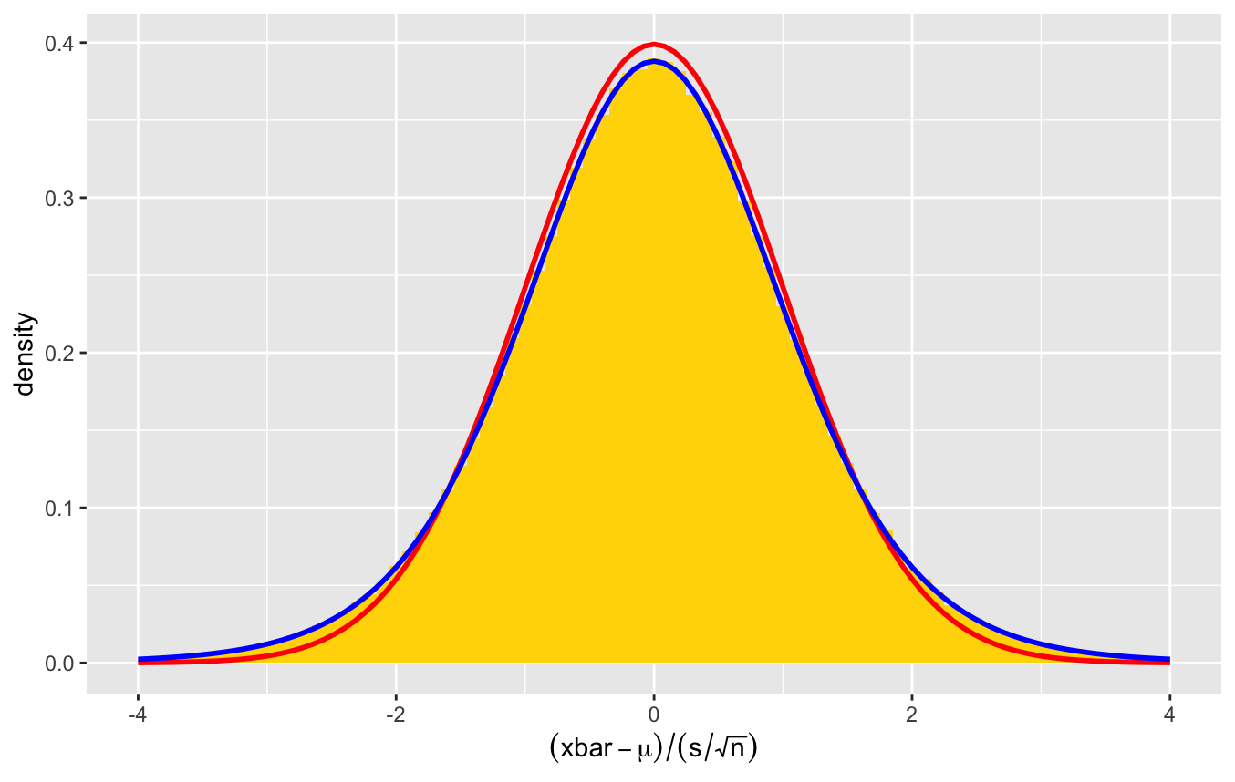
Different sample sizes show different density curves, which requires a new distribution parameter called degrees of freedom. When using \(s\) based on a sample mean, there are \(n-1\) degrees of freedom.
Confidence Intervals for Unknown Standard Deviation
When the population standard deviation \(\sigma\) is unknown, we must estimate \(\sigma\) using the sample standard deviation \(s\text{.}\) The standard score for the sample mean \(t = \frac{\overline{X}-\mu}{s/\sqrt{n}}\) then follows the t-distribution with \(n-1\) degrees of freedom.
Choose \(\alpha\) so that \(100(1-\alpha)\)% is the desired confidence level.
Find the t-score, \(t_{\alpha/2, n-1}\) as the \(1-\alpha/2\) quantile so \(P(t > t_{\alpha/2,n-1}) = \alpha/2\text{.}\)
Calculate the standard error for the sample mean:
\begin{equation*} se = s /\sqrt{n} \end{equation*}Construct the confidence interval
\begin{equation*} \overline{X} \pm t_{\alpha/2, n-1} \cdot se = \overline{X} \pm t_{\alpha/2, n-1} \cdot \frac{s}{\sqrt{n}} \end{equation*}
For very large sample sizes, the law of large numbers will imply \(s \approx \sigma\) closely and so the corresponding \(t\) distribution will be almost identical to the normal distribution. That is, using a Z-score will give almost the same results.
Confidence Intervals Using R
In R, the command that provides a confidence interval for the sample mean is t.test(). Again, the full use of this command is for a hypothesis test, but it does provide a confidence interval. The simplest call is t.test(x, conf.level=0.95).
Application 1
(Example 9 Section 8.3) A random sample of 11 completed auctions on E-bay for an unlocked Apple iPhone 5s in new condition with 16GB of storage from July 2014 gave the following prices (in dollars): 540, 565, 570, 570, 580, 590, 590, 590, 595, 610, 620.
If we calculate a 95% confidence interval based on this data, what would it mean? Find that interval.
Application 2
(Example 8 Section 8.3) The textbook website contains a dataset of how many hours respondents to the GSS in 2018 said they watched daily. Load the data, calculate the mean and standard deviation, and find the 95% confidence interval.
What does the confidence interval represent?
Choosing the Sample Size
The margin of error for the sample mean if the standard deviation is known:
If the standard deviation is not known but \(n\) is large (\(n \gt 100\) very good, \(n \gt 30\) acceptable), we can use the same formula since t-distribution will be close to Z anyway. Use \(s\) in place of \(\sigma\) for the estimation. Choosing high estimates of \(\sigma\) is a more cautious approach and results in higher value of \(n\text{.}\)
Application 3
(Based on Problem 8.54): How large a sample size do we need to estimate the annual income of Harrisonburg residents at a 99% confidence level to within $1000?
Because we know nothing about this distribution, we can start by assuming a bell-shaped distribution and making a reasonable guess on the range of income levels. We know that almost all observations from such a distribution would be within 3 standard deviations of the mean.
Special Considerations
Robustness: A method is robust if it continues to work well even if the assumptions are not all satisfied.
The confidence interval based on the t-distribution is built from the assumption that the population has a normal distribution. In practice it works reasonably well for distributions as long as there are not significant outliers. [Test if the interval changes a lot if an outlier is excluded]
Chapter 9: Hypothesis Tests
Key Ideas
(Start of Day 23) We will learn about following key ideas:
What is a null hypothesis and an alternative hypothesis?
Statistical confidence measures how much evidence we have that the null hypothesis is inadequate to explain the data. (Falsify the null hypothesis, not prove the alternative.)
Define and use a P-value.
Interpret the two types of error: Type I (Reject null when it was true) vs Type II (Fail to reject the null when it is false)
Connect confidence intervals with hypothesis tests.
Evidence and Inductive Reasoning
Statistics provides a mathematically-sound foundation by which we can characterize a method of assessing evidence for and against hypotheses.
Because we observe samples (experiments) rather than the population (perfect knowledge), random variability means that our incomplete knowledge will result in mistakes. We wish to create a repeatable (verifiable) method to make decisions that will become more likely to be correct as additional information is obtained.
Science is built on the philosophy that perfect evidence can show that a scientific hypothesis is false (because observations contradict the hypothesis) but not that a hypothesis is true (because there may be future observations that might contradict the hypothesis).
Statistics formalizes this idea by proposing that evidence is measured relative to two hypotheses: a null hypothesis and an alternative hypothesis.
Null Hypothesis vs Alternative Hypothesis
In a hypothesis test, we weigh how strongly the sample observations provide evidence that the null hypothesis is inadequate to explain the data.
Mathematically, a null hypothesis \(H_0\) is a statement that a parameter for a distribution has a particular value. It should be stated as an equation.
The alternative hypothesis \(H_A\) will be an inequality for how the parameter is different from that particular value. If the inequality uses greater than or less than, then we say the hypothesis is one-sided. If the inequality uses not equals, then we say the hypothesis is two-sided.
Example 1 of Hypotheses
My friend carries a coin to flip for making decisions. I suspect that the coin is rigged to favor heads. What are appropriate hypotheses? Is the alternative one-sided or two-sided?
Example 2 of Hypotheses
The stated mean body temperature of humans is 98.6 degrees Fahrenheit. A university wishes to test if this is correct for inhabitants of Iceland. What are appropriate hypotheses? Is the alternative one-sided or two-sided?
Nature of Evidence
Our goal is to show whether the data provide strong evidence that the null hypothesis is inadequate to explain the observed data.
The hypothesis test is based on the sampling distribution of a summary statistic (like sample proportion or sample mean) based on assuming the null hypothesis is true. Unlikely observations would be in the tails of the sampling distribution.
A scientist states a desired level of significance, which is a probability, before looking at the data. If the observed statistic is in a region that is sufficiently unlikely compared to the significance level, then the scientist reports that the evidence leads us to conclude that we should reject the null hypothesis in favor of the alternative hypothesis. Otherwise, we can only say that we fail to reject the null hypothesis.
We never say that we accept a hypothesis.
Hypothesis Test Steps
Evaluate the relevant assumptions: Observed data must be randomized, identify the parameter in question, and we need to know or have reason to believe in a specific sampling distribution for a corresponding statistic.
State a null \(H_0\) and alternative hypothesis \(H_A\) and specify an acceptable significance level \(\alpha\) (acceptable rejection probability).
Use the data to calculate a statistic for which we know the sampling distribution when \(H_0\) is true. Calculate an appropriate standardized test statistic (e.g., \(Z\) or \(t\)).
Calculate (or estimate) the P-value, the probability in the tails of the sampling distribution more extreme than the observed data. (Smaller P-value is stronger evidence.) A one- or two-sided alternative hypothesis tells us if we should include both tails (using symmetry) or not.
Decision: If the P-value is smaller than the pre-determined significance level, then we reject the null hypothesis in favor of the alternative hypothesis. Otherwise we fail to reject \(H_0\text{.}\)
Application 1
(Begin Day 24) An astrologer prepares horoscopes for 116 adult volunteers. Each subject also filled out a California Personality Index (CPI) survey. For a given adult, his or her horoscope and CPI survey are shown to the astrologer as well as the CPI surveys for two other randomly selected adults. The astrologer is asked which survey is the correct one for that adult. A total of 28 astrologers participated in the experiment.
Is there evidence that the astrologers do better than chance? (Is the third eye real?)
Assumptions
Hypotheses and Significance
Test Statistic
P-value or Rejection Region
Conclusion
Application 2
We want to find out whether there is evidence that the proportion of people opposing fracking is different from 50%.
We will use data from a Pew Research survey conducted in the United States in November 2014, which used a random sample of n = 1,353 people. Of these, 637 were opposed to fracking; the rest either favored it or had no definite opinion.
Assumptions
Hypotheses and Significance
Test Statistic
P-value or Rejection Region
Conclusion
Application 3
A study compared different psychological therapies for teenage girls suffering from anorexia. The variable of interest was each girl’s weight change: weight at the end of the study minus weight at the beginning of the study. The weight change was positive if the girl gained weight and negative if she lost weight.
We seek to know if there is evidence to suggest a therapy provides effective treatment (positive weight gain).
Assumptions
Hypotheses and Significance
Test Statistic: The study involved 29 girls, and observed weight gain had sample mean \(\overline{x}=3.00\) pounds and sample standard deviation \(s=7.32\) pounds
P-value or Rejection Region
Conclusion
Robustness and Testing Assumptions
The process of performing a hypothesis test requires knowing the sampling distribution of the test statistic. For proportions of categorical variables, we usually use a normal distribution assumption which will be valid when the sample size is large (15 expected successes and failures). For means of quantitative variables, if the variable’s population is a normal distribution, then the sampling distribution of \(\overline{X}\) (the sample mean) is normal if we know the standard deviation and a t-distribution if we standardize using the sample standard deviation.
What happens if these assumptions are not satisfied? Plot the data
In general, the methods are relatively robust and can be used anyway with the following cautions.
Binomial test is problematic if \(n\) is small and \(p_0\) is not close to 0.5 (distribution is skewed), particularly for one-sided tests.
Z-test and t-test are problematic if \(n\) is small and the population distribution has significant skew, particularly for one-sided tests.
Types of Errors
Our action in a hypothesis test is to either reject \(H_0\) or fail to reject \(H_0\). An error occurs if our chosen action does not match reality. Because data are random, we never really know if we make an error based on the data—they are hypothetical unless there is some secondary evidence that can be determined separately from the data. The null hypothesis represents our default belief, that which does not require evidence.
A Type I Error occurs when we reject \(H_0\) when \(H_0\) is actually true. This is also called a false positive. The significance \(\alpha\) of our test refers to the probability of a Type I Error given the null hypothesis.
A Type II Error occurs when we do not reject \(H_0\) when \(H_A\) is true and \(H_0\) is false. This is also called a false negative.
When I ask you to explain the meaning of a Type I or II error for an example, you must refer to the actual meaning of the hypotheses.
Comparison of Error to Jury Trials
Consider a criminal trial. The defendant is presumed innocent until proven guilty. We can think of the trial like an experiment gathering evidence. The decision of the jury is the hypothesis test.
What are the hypotheses in this context?
How could a jury make a mistake?
What mistakes correspond to a Type I error and a Type II error?
Hypothesis Tests and Confidence Intervals
One perspective of confidence intervals is that the interval would include all parameter values \(\alpha = \alpha_0\) such that a hypothesis test would fail to reject the null hypothesis \(H_0: \alpha = \alpha_0\) at the specified confidence level.
Example: The General Social Survey includes a variable HRS1 giving the number of hours worked during a week. Let’s consider the average number of hours worked by men during 2018.
Proportions and Binomial Distributions
In a 2013 survey, 740 out of 1506 respondents indicated that they opposed fracking. Use the following proportions to determine if we would reject the null hypothesis \(H_0: p=p_0\) in a two-sided test. Compare using the exact binomial probabilities with the normal approximation.
Chapter 10: Comparing Two Groups
Key Ideas
We will learn about following key ideas:
-
Comparing proportions for two subgroups, \(p_1\) and \(p_2\text{,}\) associations for two categorical variables
Confidence intervals for \(p_1 - p_2\)
Hypothesis Test: \(H_0: p_1 = p_2\) vs \(H_A: p_1 \ne p_2\)
General formula for variance when adding/subtracting independent variables
-
Comparing population means for two independent subgroups, \(\mu_1\) and \(\mu_2\text{,}\) associations between categorical and quantitative variables
Confidence intervals for \(\mu_1 - \mu_2\)
Hypothesis Test: \(H_0: \mu_1 = \mu_2\) vs \(H_A: \mu_1 \ne \mu_2\) (or one-sided alternatives)
Modifications for dependent data: matched pairs, paired survey responses
Experiments with Binary Outcomes
The simplest experiment naturally has a control group and a treatment group, so that we can considered the randomly assigned group to be a binary categorical variable. If the experiment has a binary outcome (success vs failure), then are considering a case where the population will have two different population parameters, the probability of success given the treatment choice (technically conditional probabilities).
\(p_1\text{:}\) probability of success when given the placebo treatment
\(p_2\text{:}\) probability of success when given the experimental treatment
After our experiment, we will be able to compute the conditional proportions \(\hat p_1\) and \(\hat p_2\text{.}\) We are interested in the difference in proportions:
Confidence interval for \(p_1-p_2\) (can be interpreted as percentage points of difference)
Hypothesis test: \(H_0: p_1 = p_2\) vs \(H_A: p_1 \ne p_2\)
Sampling Distribution for Proportion Difference
Suppose there are \(n_1\) individuals in control group and \(n_2\) individuals in treatment group.
\(\hat p_1\text{:}\) proportion of \(n_1\) control individuals who saw success. Mean: \(p_1\) and Std Dev: \(\sigma_1 = \sqrt{\frac{p_1(1-p_1)}{n_1}}\)
\(\hat p_2\text{:}\) proportion of \(n_2\) treatment individuals who saw success. Mean: \(p_2\) and Std Dev: \(\sigma_2 = \sqrt{\frac{p_2(1-p_2)}{n_2}}\)
Then the difference statistic \(\hat p_1 - \hat p_2\) has
Normal Approximation
If each group has at least 10 successes and failures, then \(\hat p_1 - \hat p_2\) will have an approximate normal distribution. In this case, we can use our usual approach for confidence intervals and hypothesis tests.
Question: Does taking aspirin reduce the risk of dying from cancer? Results from eight double-blinded, randomized trials compared taking aspirin to a placebo over at least 4 years, and then assessed cancer-deaths within 20 years, were combined into the following contingency table.
| Group | Cancer Death = Yes | Cancer Death = No | Total |
|---|---|---|---|
| Placebo | 347 | 11,188 | 11,535 |
| Aspirin | 327 | 13,708 | 14,035 |
Two-Group Proportion Test
We can do a two-group proportion test in R using prop.test using the following format:
prop.test(x=c(x1,x2), n=(n1,n2), conf.level=0.95)
alternative = "greater" or alternative = "less" if doing a one-sided test.Comparing the Means for Two Groups
There is a similar strategy for comparing the means between two groups, assuming independence. If the observations for the groups come from the normal distribution, then \(\overline X_1\) and \(\overline X_2\) will have normal distributions:
Two Population t Test
If we don’t know the standard deviations and need to use the sample standard deviations, then instead of using Z values, we would need to use t values. The formula for degrees of freedom is complicated, so we will just use software.
First, we need to have a vector containing the sample observations for \(X_1\) and another vector containing the observations for \(X_2\text{.}\) The following will calculate a confidence interval for \(\mu_1 - \mu_2\) and perform a hypothesis test with a null \(H_0: \mu_1 = \mu_2\text{.}\)
t.test(x=x1, y=x2, conf.level=0.95)
alternative="greater" or alternative="less".
The results will show the confidence interval, the sample means, the test statistic, the degrees of freedom, and the p-value.
Pooled Proportions
(Start Day 26) When performing a hypothesis test, the P-value and/or the critical values for the test statistic are based on the sampling distribution assuming the null hypothesis is true. If we are comparing proportions from two independent groups with \(H_0: p_1 = p_2\text{,}\) then we should generate the standard error assuming that there is a single proportion \(p\) for both groups.
Confidence interval considers separate proportions: \(\hat p_1 = \frac{x_1}{n_1}\) and \(\hat p_2 = \frac{x_2}{n_2}\)
\begin{equation*} se = \sqrt{\frac{\hat p_1(1- \hat p_1)}{n_1} + \frac{\hat p_2(1- \hat p_2)}{n_2}} \end{equation*}Hypothesis test considers pooled proportion when estimating the standard error: \(\hat p = \frac{x_1 + x_2}{n_1 + n_2}\)
\begin{equation*} se_0 = \sqrt{\frac{\hat p(1-\hat p)}{n_1} + \frac{\hat p(1-\hat p)}{n_2}} = \sqrt{\hat p(1- \hat p)\Big(\frac{1}{n_1} + \frac{1}{n_2}\Big)} \end{equation*}
Analyzing Dependent Samples (10.4)
Our previous work looked at independent observations from two groups. The observations could be dependent if observations are paired, meaning that the observation for the first group is linked to a corresponding observation for the second group.
same individual, measurements for each of two different treatments or before/after treatment
paired individuals (e.g., partners), measurement for each individual
Having dependent samples changes the sampling distribution so we need slightly different methods. R has an optional argument to indicate that the two groups are paired when doing tests.
Paired Differences: Comparing Means with Dependent Samples
For each pair, there will be two observations \(x_1\) and \(x_2\text{.}\) We will generate a computed third quantity \(d = x_1 - x_2\text{.}\)
Because of the dependence, we do not have a simple formula for the standard deviation of \(d\) even if we know the standard deviations for \(x_1\) and \(x_2\text{.}\) Instead, we treat this new variable \(d\) as a one-sample population for which we can create confidence intervals or perform hypothesis tests.
Comparison of Approaches
The textbook gives an example of the same experiment studying cell phones and driving performed once with two treatments assigned to individuals randomly, forming independent observations, and a second time with both treatments performed by each individual (Example 9 and Example 13). One treatment was to listen to the radio or audio books while driving and then test reaction times. The second treatment was to have a phone conversation while driving and test the same reaction times. The question: “Does using the cell phone slow down reaction rate?”
Data for Independent Observations: Cell Phone Reaction Times
Data for Paired Observations: Paired Reaction Times
Proportions with Dependent Samples
On a survey, the same individuals might be asked to respond to two different binary outcome questions. Because the two questions are being answered by the same individuals, the results are inherently dependent. (The independent analogue would be to randomly decide which individuals are asked only one of the questions each.) This is very common because we actually want to know the associations between different questions for individuals. Measuring dependent data is necessary to do this.
Suppose a survey asked individuals, “Do you believe in heaven?” and separately “Do you believe in hell?” We would expect an association between these beliefs. (Why?) We might be interested in using survey results to say something about a question, “Is the proportion of the population that believes in heaven larger than the proportion that believes in hell?”
| Believe in Heaven | Believe in Hell = Yes | Believe in Hell = No | Total |
|---|---|---|---|
| Yes | 955 | 162 | 1117 |
| No | 9 | 188 | 197 |
| Total | 964 | 350 | 1314 |
McNemar’s Test Comparing Proportions
Consider a contingency table (frequencies or counts) showing the paired relationships of two binary choices
R implements this using a command mcnemarExactDP (exact difference in proportion) from a library exact2x2. There are the usual optional arguments alternative and conf.level.
library(exact2x2)
mcnemarExactDP(x=b, m=b+c, n=a+b+c+d)
Chapter 11: Categorical Data Analysis
Key Ideas
We will learn about following key ideas:
Independence and Dependence and Associations
Generalizing Binomial to More than 2 Categories
Chi-Square distribution and test
Categorical Association
Suppose that \(X_1\) and \(X_2\) are categorical variables (not necessarily binary). In principles, \(X_1\) might have \(k_1\) choices and \(X_2\) might have \(k_2\) choices.
Recall that two variables have an association if knowing the value of one variable changes the distribution of the other variable. In other words, \(X_1\) and \(X_2\) have an association is equivalent to saying \(X_1\) and \(X_2\) are dependent.
We are often interested in showing there is an association, so the hypothesis test becomes
Sample frequencies will be presented as contingency tables. We have visualized these ideas previously by looking at side-by-side bar graphs or stacked bar graphs.
Expected Contingency Table
Recall that events \(A\) and \(B\) are independent means that \(P(A \cap B) = P(A) \cdot P(B)\text{.}\) Under the null hypothesis of independence between the categorical variables, the probability of any given cell in row \(r\) and column \(c\) can be found:
For every cell in the contingency table, we will compute an expected count. Let \(N\) be the total sample size.
We will want to see if the actual contingency table is extremely different than the expected table if we are going to reject the null hypothesis.
GSS Income and Happiness (1)
The textbook discusses an example from the General Social Survey, looking at whether Happiness and Income Level are associated.
| Income | Not Too Happy | Pretty Happy | Very Happy | Total |
|---|---|---|---|---|
| Above Average | 29 | 178 | 135 | 342 (19.7%) |
| Average | 83 | 494 | 277 | 854 (49.3%) |
| Below Average | 104 | 314 | 119 | 537 (31.0%) |
| Total | 216 (12.5%) | 987 (56.9%) | 531 (30.6%) | 1733 |
GSS Income and Happiness (2)
| Income | Not Too Happy | Pretty Happy | Very Happy | Total |
|---|---|---|---|---|
| Above Average | 29 (42.6) | 178 (194.6) | 135 (104.8) | 342 |
| Average | 83 (106.4) | 494 (485.9) | 277 (261.7) | 854 |
| Below Average | 104 (66.9) | 314 (305.5) | 119 (164.5) | 537 |
| Total | 216 (12.5%) | 987 (56.9%) | 531 (30.6%) | 1733 |
In 1900, Karl Pearson introduced the \(\chi^2\) (chi-squared) statistic, the oldest statistic in use today.
Sampling Distribution of Chi-Squared
The \(\chi^2\) statistic follows a chi-squared distribution. The value is always non-negative and the distribution is unimodal and skewed to the right. The degrees of freedom acts as a shape parameter. The expected value of \(\chi^2\) is exactly the value of the degrees of freedom:

In Practice: Use Computation
R will calculate the chi-squared test using the command chisq.test(). Pass in as the argument the contingency table. The test will report the test statistic, the number of degrees of freedom, and the P-value. There is no relevant confidence interval as this hypothesis test is not about a parameter.
Chi-Squared Assumptions
Every hypothesis test is associated with key assumptions about the data that the practitioner must verify. For the chi-squared test of independence, we have the following:
Two categorical variables.
Observations were randomized, so that the observations are representative of the population
Expected count in every cell is at least 5.
fisher.test). It is computationally more expensive and harder to describe, and so it is not the default choice.Multinomial Distribution
In addition to be able to test two categorical variables for independence, the chi-squared test can also be used for a single categorical variable (or discrete quantitative) to test for a specific set of probabilities for each category (or value). This generalizes the binary choice that was present used for the binomial distribution and is referred to as the multinomial distribution.
Suppose that for each subject, there is a categorical (or finite discrete) random variable with \(k\) possible values. Each of the categories has an associated population proportion \(p_1, p_2, \ldots, p_k\text{.}\) Because they are probabilities, they must add to 1:
Chi-Squared as Goodness of Fit
With actual counts \(X_i\) and expected counts \(\mu_i = n p_i\text{,}\) we can compute the chi-squared test statistic in the same way that we did for contingency tables:
The assumptions for our test are that the expected count in each category is at least 5. Otherwise, the \(\chi^2\) distribution is not a good approximation. The hypothesis test is for a null hypothesis that all of the population proportions are equal to some specific values. The alternative hypothesis is that at least one of the population proportions does not match the proposed values. The P-value is calculated using the right-tail cumulative probability beyond the test statistic value.
Pass the Pigs Experiment
Mendelian Genetics
Example 6: Gregor Mendel crossed different pure strains of pea plants (yellow and green), where yellow is the dominant trait. If color is determined by a single gene, then Mendelian genetics predicts that 75% of offspring will be yellow and 25% will be green.
An experiment had 8,023 hybrid seeds. When the seeds grew, there were 6,022 yellow plants and 2,001 green plants. Is this consistent with Mendel’s theory?
Note: Since there are two outcomes, this can be analyzed using both a proportion test and a chi-square test.